
The best blog CTA feels like the next helpful step, not a sales trap. Place it where reader intent is already high, match it to the section they just read, and keep the design calm enough that it does not hijack attention. A good CTA should answer one silent reader question: “What should I do now?” If it cannot answer that, it probably does not belong there.
TLDR: Add calls to action after valuable sections, not before the reader gets what they came for. Use contextual CTAs, such as “Download the checklist” after a how-to section, instead of a generic “Contact us” button. In one content audit, moving a newsletter CTA from the first screen to after the third section raised signups by 28% while average scroll depth stayed above 70%. The reader got help first, then saw a relevant next step.
Why blog CTAs often feel annoying
Most blog CTAs fail because they arrive too early, shout too loudly, or ask for too much. A reader opens a post to solve a problem. Then a popup blocks the first paragraph. Or a sticky banner eats half the screen on mobile. It drives me crazy when a site asks for an email address before proving it has anything useful to say.
A blog CTA should not compete with the article. It should support the article. The reader’s attention is already fragile. If you interrupt the flow, they may bounce, skim badly, or ignore every button on the page.
The goal is not to remove CTAs. The goal is to add them with timing, context, and restraint.


Start with reader intent
Before choosing a CTA, ask what the reader wants at that exact point in the post. Someone reading a beginner guide may want a template. Someone comparing tools may want a pricing sheet. Someone reading a case study may want a demo or consultation.
Intent should shape the offer. A mismatch makes the CTA feel forced.
- Educational post: offer a checklist, worksheet, glossary, or related guide.
- Comparison post: offer a feature table, buyer’s guide, or trial.
- Case study: offer a demo, audit, or consultation.
- Opinion post: offer a newsletter signup or deeper report.
- How-to tutorial: offer a template, calculator, or downloadable steps.
This simple matching process keeps the CTA useful. It also makes the ask feel smaller. Readers respond better when the offer helps them finish the job they already started.
Use the three best CTA placements
Effective CTA placement depends on rhythm. You want to place CTAs at natural pauses, not in the middle of a thought. Think of the article as a conversation. You would not interrupt someone mid-sentence to sell them something. Do not do it in your blog layout either.
1. After the introduction, but only if the offer is low pressure
An early CTA can work if it helps the reader right away. For example, a short box that says, “Want the spreadsheet version? Download it here.” That is useful, not pushy. Avoid aggressive demo requests this early unless the article is written for high-intent buyers.
2. After a major section
This is often the strongest spot. The reader has received value. They understand the topic better. A related CTA feels earned. For example, after a section on blog planning, you might add a button for a content calendar template.
3. At the end of the post
The end is perfect for a stronger CTA. The reader has finished the piece, which signals interest. Here you can suggest booking a call, starting a free trial, reading a related guide, or joining a list.
The catch is that many people never reach the end. So do not put your only CTA there. Use one or two earlier placements as well.
Make the CTA copy specific
Generic button copy is weak. “Submit” is cold. “Click here” says nothing. “Learn more” is better, but still vague. Strong CTA copy tells the reader what they get and why it matters.
Compare these examples:
- Weak: Sign up
- Better: Get weekly SEO tips
- Strong: Send me the 10 point SEO checklist
- Weak: Contact us
- Better: Book a consultation
- Strong: Book a 20 minute content audit
Specific copy reduces doubt. It also sets expectations. If the CTA says the audit takes 20 minutes, the reader knows the commitment. That small detail can increase clicks because it removes a hidden worry.


Design CTAs that fit the reading experience
A CTA should stand out, but not scream. Use contrast, spacing, and clear labels. Do not rely on giant blocks, flashing effects, or sticky overlays that follow the reader like an anxious salesperson.
Here are practical design rules:
- Use one main action per CTA block. Too many choices reduce clicks.
- Keep button text short. Five to eight words usually works well.
- Add white space. A cramped CTA feels like an ad.
- Use a calm border or shaded box. This separates it from the article without breaking the flow.
- Make mobile spacing comfortable. Tiny buttons cause misclicks and irritation.
On mobile, be extra careful. A sticky footer CTA can work, but only if it is slim and easy to close. If it covers content, it will hurt the experience. Expect readers to leave if your popup takes more effort to dismiss than the article takes to scan.
Match CTA strength to reader readiness
Not every reader is ready to buy. That is why blogs need different CTA types. Think in layers.
- Soft CTA: read a related article, save a checklist, join a newsletter.
- Medium CTA: watch a webinar, start a free trial, use a calculator.
- Strong CTA: request a quote, book a demo, schedule a call.
Soft CTAs work near the top. Medium CTAs work after the reader has seen proof. Strong CTAs work near the end, in buyer-focused posts, or after case study sections.
This matters because pressure breaks trust. A first-time reader may not want a call. But they might download a checklist. Once they trust your advice, they may return later and take a stronger action.
Use inline CTAs without ruining the paragraph
Inline CTAs can be smooth when they feel like part of the article. For example: “If you are planning your first content audit, this free checklist can help you spot missing CTA opportunities.” That sentence gives context before making the offer.
Bad inline CTAs feel dropped in from another planet. They use a different tone. They push an unrelated product. They stuff the paragraph with sales copy. Keep inline CTAs short and relevant.
A useful rule: if removing the CTA makes the paragraph clearer, the CTA needs rewriting or relocation.
Measure engagement, not just clicks
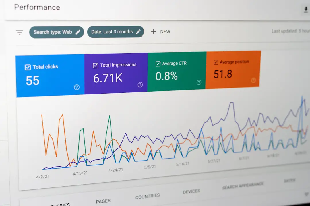
A CTA with a high click rate can still be bad if it hurts reading behavior. Track more than conversions. Watch the full picture.
- Scroll depth: Are readers still reaching key sections?
- Time on page: Did the CTA reduce reading time?
- Bounce rate: Are popups pushing people away?
- CTA click rate: Which offer earns interest?
- Conversion rate after click: Do clicks turn into real leads or sales?
For example, if a mid-article CTA gets a 4.5% click rate but scroll depth drops from 68% to 41%, something is wrong. The CTA may be too disruptive. Try a smaller block, better timing, or a softer offer.
Test one change at a time
CTA testing gets messy fast. If you change the copy, color, placement, and offer in one test, you will not know what caused the result. Test single changes.
- Move the CTA from the top to after the first useful section.
- Change “Subscribe” to “Get the weekly content checklist.”
- Replace a demo request with a lower pressure template.
- Test a text link against a boxed CTA.
Run the test long enough to collect useful data. A small blog may need several weeks. A high-traffic blog may learn faster. Either way, do not panic after one quiet day.
A simple CTA plan for your next blog post
Use this structure if you want a reliable starting point:
- Intro: no hard sell. Add only a helpful download if it fits.
- After the first major section: add a soft contextual CTA.
- Middle of the post: add a related resource or tool.
- End of the post: add the strongest CTA that matches the topic.
Then check the data. If engagement drops, reduce the visual weight or move the CTA lower. If clicks are weak, sharpen the offer. If clicks are strong but conversions are poor, the landing page may be the problem.
A good blog CTA does not interrupt attention. It rewards it. Give readers value first, offer the next step at the right moment, and make that step clear. That is how CTAs become part of the reading experience instead of the thing that ruins it.