
You may have observed: These are stressful times. From 2020 to now, people have consistently reported high levels of burnout, exhaustion, and fatigue. This situation has numerous implications, including for product design.
Even under regular circumstances, users typically don’t begin their interaction with a digital product completely free from stress, as Katie Swindler, a senior user experience strategist at Allstate, points out. For example, imagine a user trying to handle a hacked account or someone attempting to use an app while managing a crying child.
That’s why Swindler’s new book, “Life and Death Design,” is aimed not only at designers of high-consequence systems. Even if you are not creating critical elements like hospital alerts or emergency stops, many of your users may still experience a level of stress comparable to those in more severe situations.

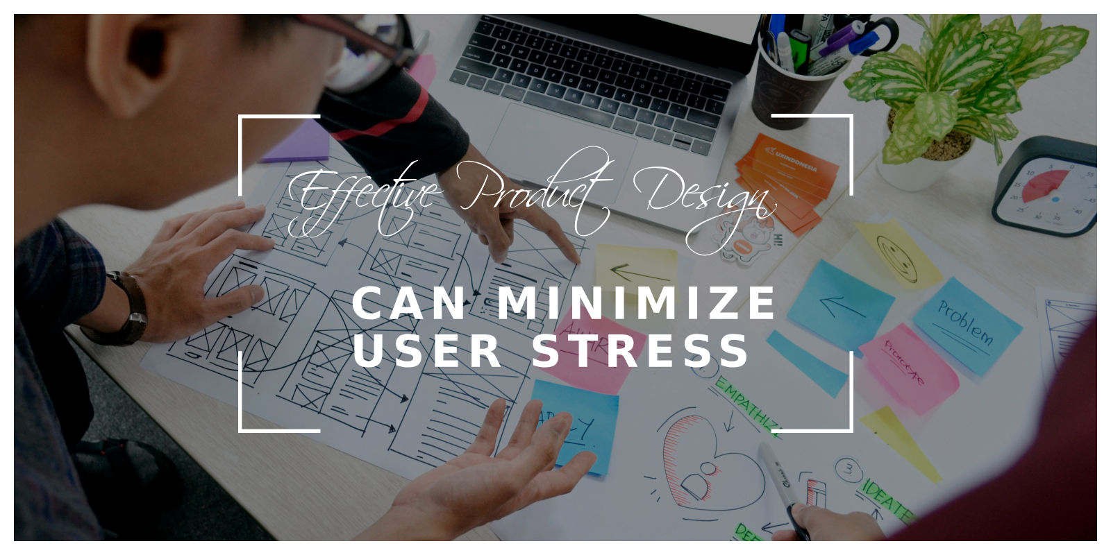
Six Key Lessons from Life-and-Death Design for All Products
- Optimize Button Design: Ensure that essential buttons are large and positioned where users can easily access them.
- Simplify Button Text: Use concise, clear language on buttons and include action verbs to enhance clarity.
- Choose Readable Fonts: Select fonts for your user interface that have good letter spacing and open letter shapes.
- Check Color Contrast: Utilize a contrast checker to verify that color contrasts adhere to accessibility standards.
- Enhance UX Writing: Employ approachable storytelling in your UX writing. For complex information, maintain a conversational tone and use personalized examples to aid comprehension.
- Simplify Complex Information: Break complex information into smaller, manageable parts. Use slide-out panels to elaborate on concepts and employ subheadings and visual elements to organize content effectively.
In her book, Swindler explores the neuroscience behind stress responses—how stress hormones trigger the startle reflex, push us towards quicker, more intuitive decision-making, and provoke fight-flight-or-freeze reactions. She also examines what UX designers can do to mitigate this panic and help users return to a state of calm.
Through this perspective, we invited Swindler to guide us through several projects from her tenure at Allstate to explore how each offers broader lessons for all UX designers and product managers.
Can UX Design Reduce Panic?
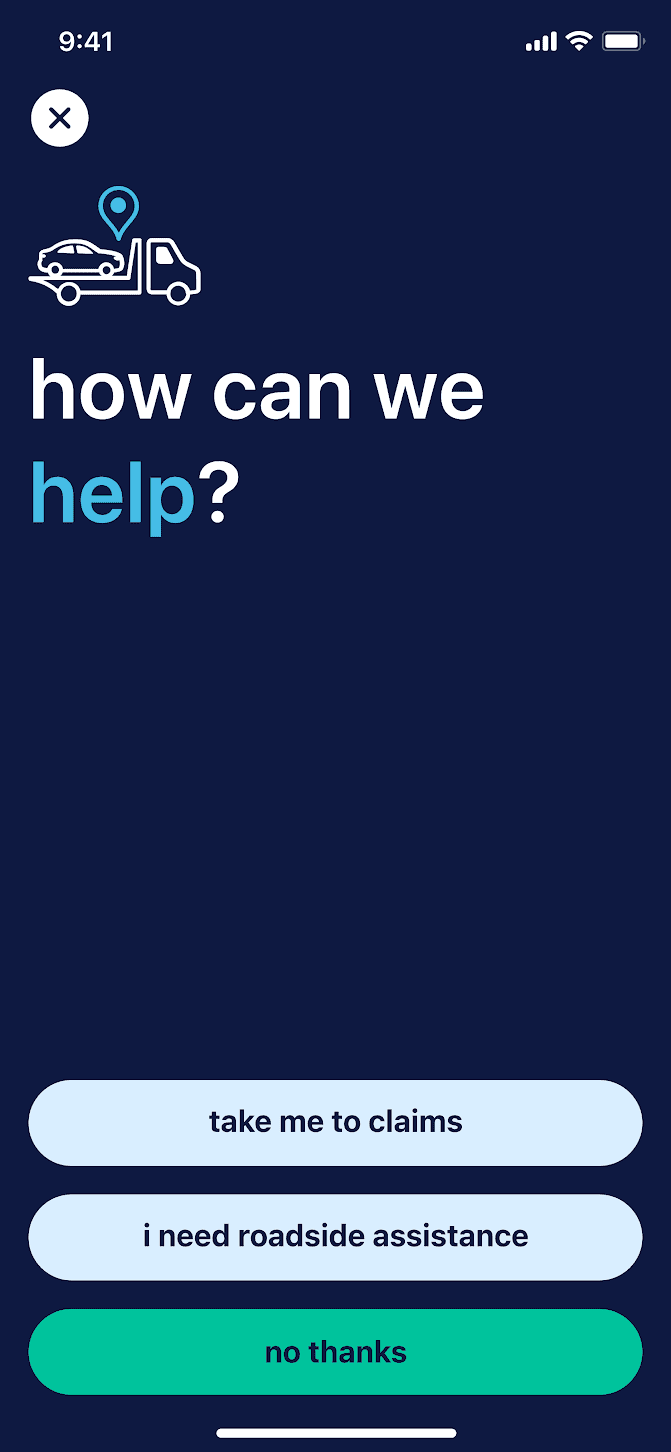
Few situations are as stressful or critical as an automobile accident, and navigating emergency services or roadside assistance afterward can be extremely challenging. Swindler worked on a design to help users through these difficult moments: a crash detection feature in Allstate’s mobile app.
When the app detects a crash, it offers users a quick link to call 911. If users choose not to call, they are directed to the next screen which presents three options: call for roadside assistance, file a claim, or exit the application.
This screen includes several deliberate design choices, each with importance that extends beyond just responding to a crash. Let’s explore these choices. For a deeper understanding of the crash detection feature’s development, watch this video on YouTube.
Button Size and Location
In a presentation leading up to her book, Swindler referred to the iconic red emergency button as “the epitome of critical design elements.” Its visual and universally recognized nature makes it a standard reference for other design systems. Learn more about designing effective systems in this blog about design systems.
Of course, it’s not feasible to replicate the physical tactility of a stop button in a flat surface design, but digital buttons can be made equally visible and accessible—an important consideration for users experiencing stress, Swindler points out. Observe that all three buttons in Allstate’s crash detection feature span the full width of the screen. They are as large as possible without confusion. “You don’t want them so large that your options disappear off the screen,” Swindler explained.
Notice also the placement at the bottom of the screen, where thumbs naturally rest. A notable recent instance of this design approach was last September when iOS 15 moved the address bar to the bottom of Safari, reflecting a trend in UX design that has been evolving for years. Together with button size, this placement is crucial for simplifying navigation for users under stress.
“You can operate it with either thumb, whether you’re left- or right-handed. Also, consider if you’re in a crash and can only use one hand because the other is trapped. In such cases, the button must be easy to use,” Swindler explained.
Word Selection, Color, and Font
In a presentation leading up to her book, Swindler referred to the iconic red emergency button as “the epitome of critical design elements.” Its visual and universally recognized nature makes it a standard reference for other design systems. Learn more about effective product design at Linkup Studio.
Naturally, the size and placement of buttons provide limited assistance to a stressed user unless they are accompanied by effective language and thoughtful presentation. “Being concise is crucial, but clarity is just as important,” Swindler noted.
The crash detection feature combines plain, straightforward language with a focus on action verbs to make instructions clear and direct (e.g., “take me to claims” instead of just “claims”). This is generally sound usability practice, but it becomes even more crucial in high-stakes or high-stress situations.
Another crucial element is font selection. While Swindler did not personally choose the typeface used in the crash detection feature—Allstate had commissioned it earlier—it still demonstrates the type of UI legibility that is vital for users in stressful situations. “It performs exceptionally well in UI environments where enhanced legibility is crucial,” she noted.
Lastly, think about color contrast. The text must stand out clearly against the background, especially in urgent situations. This level of clarity doesn’t happen by chance.
Swindler mentioned that when Allstate’s chief creative officer joined the company a few years ago, he involved the UX team in discussions about evolving the brand identity. He emphasized the importance of selecting color palettes with good contrast ratios to ensure high legibility throughout the design process. Further insights on creating effective product design processes can be found in this detailed blog on the product design process.
Additionally, it’s crucial to use contrast checkers, particularly in critical user contexts, to ensure that readability is always a priority.