
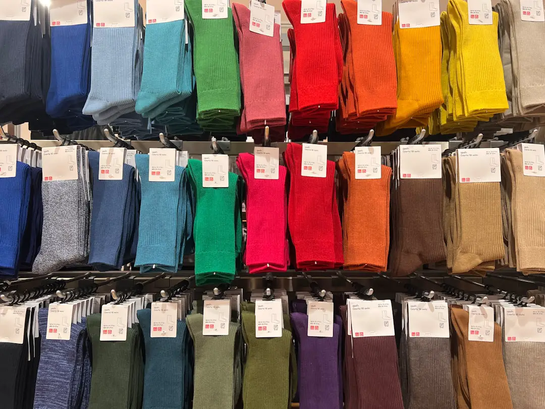
Color and texture are not decorative afterthoughts in character illustration; they are structural choices that influence recognition, emotion, storytelling, and commercial usability. A well-designed character can be weakened by generic colors or flat surfaces, while a simple silhouette can become memorable when supported by a disciplined palette and meaningful material treatment.
TLDR: Distinctive colors and textures help character illustrations feel more memorable, emotionally precise, and professionally finished. For example, a game studio redesigning a mascot with a limited teal, amber, and charcoal palette could improve recognition across small app icons, posters, and merchandise. In practical brand testing, teams often look for measurable gains such as a 15% to 30% increase in recall after refining color contrast and surface detail. The best results come from treating color and texture as storytelling tools, not visual decoration.
Why Color and Texture Matter
Character illustration works because viewers make fast decisions. Within seconds, they judge whether a character is friendly, dangerous, elegant, chaotic, comic, or authoritative. Color directs that judgment immediately, while texture gives the design credibility and tactile presence. Together, they help the viewer understand not only what the character looks like, but also what kind of world the character belongs to.
A bright citrus palette may suggest energy, youth, or humor. Muted earth tones can imply age, survival, discipline, or realism. Polished metal, cracked leather, soft fur, transparent fabric, and rough stone each carry different associations. When these decisions are aligned with the character’s role, the illustration becomes more persuasive.
Building a Purposeful Color System
Distinctive color begins with restraint. Many weak character designs fail because they use too many unrelated colors. A stronger approach is to build a controlled system with a dominant color, one or two supporting colors, and selective accents. This creates visual hierarchy and keeps the design readable across different formats.
A practical color structure may include:
- Primary color: the main identity signal, often used on clothing, skin features, armor, or hair.
- Secondary color: a supporting tone that adds contrast without competing for attention.
- Accent color: a high-impact detail used sparingly for eyes, symbols, weapons, jewelry, or magical effects.
- Neutral base: grays, browns, off-whites, or deep blacks that stabilize the composition.
This approach is valuable because it prevents visual noise. For instance, a forest guardian character might use moss green as the primary color, dark bark brown as the secondary color, and a faint gold accent in the eyes. The result feels intentional, readable, and thematically grounded.
Using Color Psychology with Care
Color psychology can be useful, but it should not be treated as a fixed formula. Red does not always mean danger; it can also express passion, royalty, heat, or celebration depending on culture and context. Blue may suggest calm or intelligence, but it can also feel cold, distant, or melancholic. The surrounding design determines how the color is interpreted.
Professional illustrators often test palettes against the character’s narrative function. A villain does not need to be black and red. A healer does not need to be white and green. More distinctive results often come from careful contradiction: a gentle character in severe colors, or a dangerous character in elegant, pale tones. These choices create complexity and help avoid clichés.
Texture as Evidence of Story
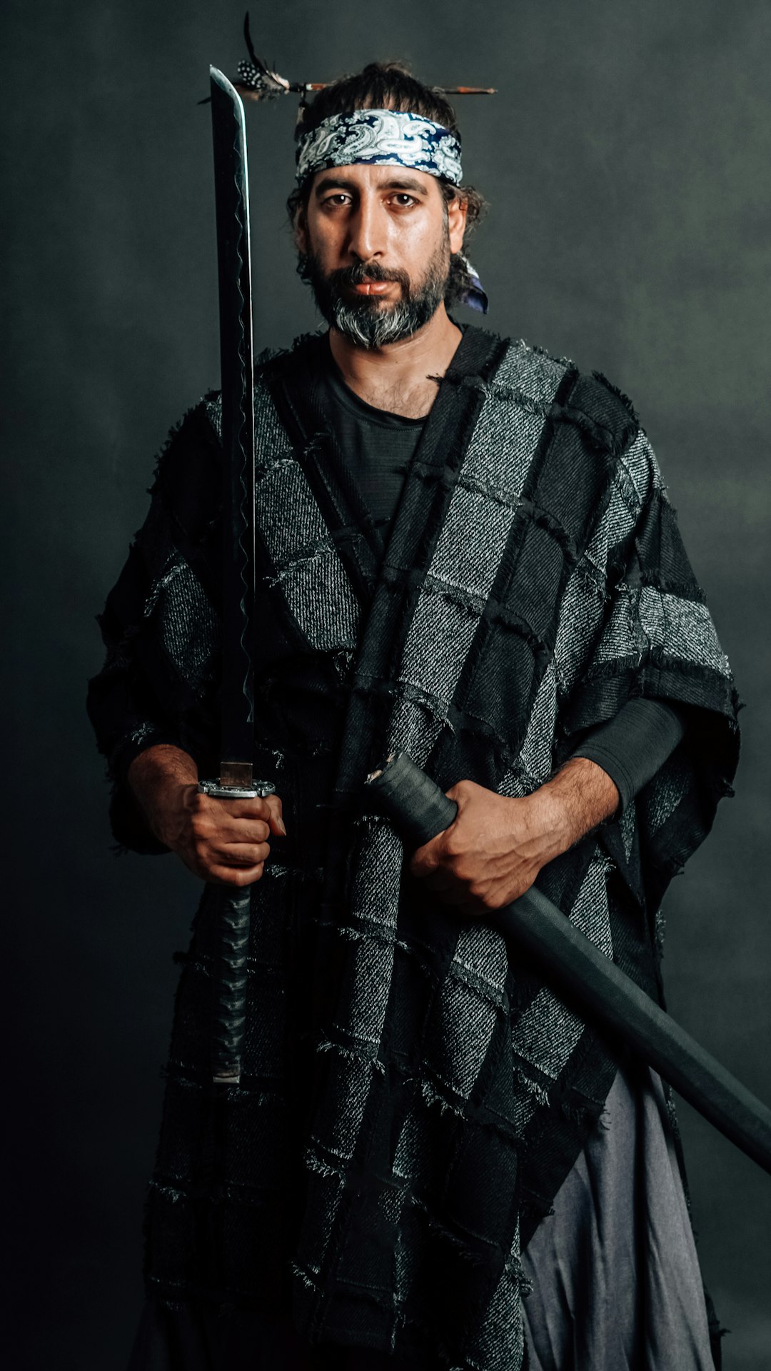
Texture gives a character a past. A spotless uniform suggests order, wealth, or artificiality. Scratched armor suggests combat experience. Worn boots imply travel. Frayed cloth may suggest hardship, while embroidered silk may indicate rank, ceremony, or vanity. Texture is effective because it shows information rather than explaining it.
There are several texture categories worth considering:
- Material texture: the surface quality of fabric, metal, skin, fur, scales, wood, or glass.
- Environmental texture: dust, mud, rain, rust, smoke residue, or sun fading.
- Biological texture: scars, pores, freckles, wrinkles, veins, feathers, or scales.
- Symbolic texture: patterns, markings, engraving, tattoos, or decorative wear that communicates culture or status.
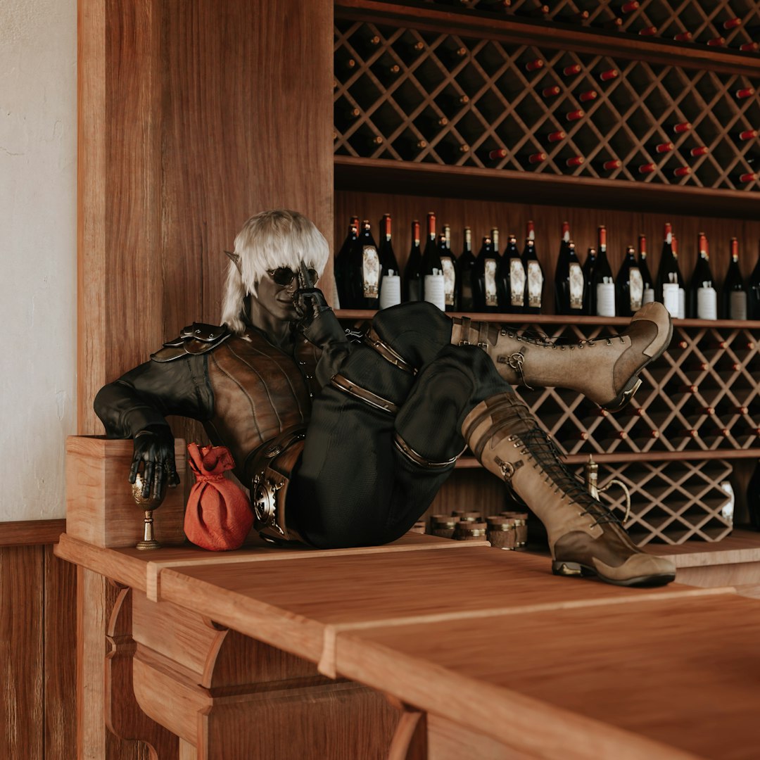
These details should be selective. Over-texturing every surface can flatten the image because nothing feels important. The best character illustrations often reserve the highest detail for areas of narrative focus, such as the face, hands, weapons, or a signature garment.
Balancing Readability and Detail
A character illustration must work at multiple sizes. It may appear as a full-page artwork, a social media avatar, a game sprite, a trading card, or a product graphic. For this reason, distinctive color and texture must support readability rather than overwhelm it.
One reliable method is to test the character in grayscale. If the design still reads clearly without color, the value structure is strong. Then, when color is restored, it enhances the design instead of carrying all the visual responsibility. Similarly, reducing the character to thumbnail size can reveal whether the palette and major shapes remain recognizable.
Texture should also be grouped in meaningful zones. A leather jacket does not need identical grain everywhere. Brighter highlights, sharper edges, and denser texture can be placed near focal points, while quieter areas can remain simpler. This creates visual rhythm and prevents fatigue.
Creating Contrast Without Losing Unity
Contrast is essential for distinction. Characters often become memorable because they contain a strong internal tension: soft skin against heavy armor, delicate lace beside mechanical joints, glowing eyes in a matte face, or smooth fabric interrupted by rough stitching. These contrasts help the viewer remember the design.
However, contrast must be controlled by unity. Repeated color notes, consistent lighting, and related texture patterns can hold diverse elements together. For example, a desert wanderer might combine rough linen, polished brass, sunburned skin, and glass beads. These materials differ, but they can be unified through warm highlights, sandy shadows, and a limited ochre-based palette.
Adapting Color and Texture to Genre
Different genres reward different visual strategies. In children’s illustration, colors are often cleaner and texture is simplified to preserve warmth and clarity. In dark fantasy, textures may be heavier, with tarnished metals, stained fabrics, and low-saturation palettes. In science fiction, sleek surfaces, luminous accents, and synthetic materials can suggest advanced technology.
Still, genre conventions should be used thoughtfully. A serious project benefits from originality within recognizable boundaries. If every futuristic character uses blue light and chrome, a restrained ivory suit with subtle ceramic texture may feel more distinctive. If every barbarian is leather and fur, woven fibers, ritual paint, or volcanic glass could create a fresher identity.
Practical Workflow for Stronger Results
A dependable workflow reduces guesswork and encourages consistency. Before adding texture, define the character’s purpose, environment, and emotional tone. Then build the palette, test readability, and apply materials with narrative intent.
- Define the character brief: role, personality, age, culture, environment, and visual function.
- Create palette options: produce several limited palettes before committing to one direction.
- Check value contrast: confirm that the character reads clearly in black and white.
- Assign materials: decide what each surface is made of and why it belongs to the character.
- Add texture selectively: concentrate detail where it supports expression, story, or silhouette.
- Test across formats: review the design at small, medium, and large sizes.
Common Mistakes to Avoid
One common mistake is using color only because it looks attractive in isolation. A beautiful purple may still be wrong if it contradicts the character’s role or weakens the composition. Another mistake is applying generic digital texture overlays that do not match the form. Texture must follow volume, lighting, and material logic; otherwise, it appears pasted on.
It is also risky to rely too heavily on trends. Popular palettes can make work feel current, but they can also make characters look interchangeable. A trustworthy illustration process balances contemporary taste with character-specific reasoning.
Conclusion
Elevating character illustrations with distinctive colors and textures requires discipline, observation, and narrative clarity. The strongest designs use palette and surface detail to reveal personality, history, environment, and emotional tone. When color creates identity and texture provides evidence, a character becomes more than an image; it becomes believable. By choosing fewer colors more carefully, applying texture with purpose, and testing readability at every stage, illustrators can create characters that feel memorable, serious, and visually enduring.