Customizing the text color in your PrimeVue theme can significantly enhance your application’s aesthetics and improve user experience. PrimeVue, a popular UI component library for Vue.js, allows for extensive styling options through its theming capabilities. This article will guide you through the process of presetting text colors in PrimeVue themes, ensuring your application looks polished and cohesive.
Understanding PrimeVue Themes

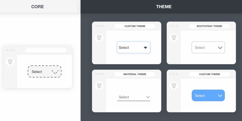
Before diving into text color customization, it’s essential to understand how PrimeVue themes work. Themes in PrimeVue define the overall look and feel of your application, including colors, fonts, and component styles. The library offers several default themes, each with its own set of color variables. By customizing these themes, you can maintain a consistent style across your application while tailoring it to your branding needs.
How to Preset Text Color in PrimeVue Theme
Setting Up PrimeVue in Your Project
To begin customizing your text colors, ensure you have PrimeVue installed in your Vue.js project. You can easily set it up by following these steps:
- Install PrimeVue: Use npm or yarn to add PrimeVue to your project.npm install primevue
npm install primeicons - Configure PrimeVue: In your main JavaScript file (typically
main.jsormain.ts), import PrimeVue and its CSS files.import { createApp } from ‘vue’;
import App from ‘./App.vue’;
import PrimeVue from ‘primevue/config’;
import ‘primevue/resources/themes/saga-blue/theme.css’; // Import a default theme
import ‘primevue/resources/primevue.min.css’; // Core styles
import ‘primeicons/primeicons.css’; // Iconsconst app = createApp(App);
app.use(PrimeVue);
app.mount(‘#app’);
Using CSS Variables for Text Color Customization
PrimeVue themes utilize CSS variables to manage colors, making it simple to customize text colors across your application. To change the text color, you’ll modify these variables.
- Locate the CSS Variables: Each PrimeVue theme comes with a set of predefined CSS variables. For text colors, you might find variables like
--primary-text-color,--secondary-text-color, and--text-color. - Override Default Values: You can create a custom CSS file where you override these variables. Here’s an example of how to set your text colors:
:root {
–primary-text-color: #333333; /* Change to your desired color */
–secondary-text-color: #666666; /* Adjust as needed */
} - Include Your Custom CSS: Ensure your custom CSS file is included in your project after the PrimeVue CSS imports to apply your changes effectively.
Creating a Custom Theme for Text Color
If you want to create a completely custom theme based on an existing PrimeVue theme, follow these steps:
- Copy the Default Theme CSS: Start by copying the CSS file of the theme you want to modify (e.g.,
saga-blue.css). - Modify the Variables: Open your copied CSS file and change the text color variables to your liking, similar to the previous section.
- Save and Apply Your Custom Theme: Link your custom theme in the main JavaScript file:
import ‘./custom-theme.css’; // Link your custom theme
Implementing Text Color Changes in Components
Once you’ve set your text colors, it’s time to apply them to PrimeVue components. You can use the default styles by ensuring your components utilize the global text color variables.
- Example with a Button: <Button label=”Click Me” class=”p-button” />
The button will automatically adopt the primary text color defined in your theme. - Applying Specific Colors: If you want to apply specific text colors to certain components, use inline styles or class bindings to achieve this.
Testing and Adjusting Text Colors
After implementing your changes, it’s crucial to test the text colors for accessibility. Ensure that your text contrasts well against background colors for easy readability. Tools like the WebAIM Color Contrast Checker can help assess the contrast ratio to ensure compliance with accessibility standards.
Troubleshooting Common Issues
Sometimes, text colors may not appear as expected. Here are a few common troubleshooting steps:
- Text Color Not Applying: Ensure your custom CSS file is correctly linked and loaded after the PrimeVue styles. Check for any specificity issues that might override your styles.
- Browser Compatibility: Test your app in different browsers to ensure consistency. Some older browsers may not support CSS variables.
- Component Specificity: If certain components have their own styles, you may need to use more specific CSS selectors to enforce your text colors.
Conclusion
Customizing text colors in your PrimeVue theme is a straightforward process that can significantly enhance the look of your application. By using CSS variables and understanding how themes work in PrimeVue, you can easily set preset text colors that align with your brand. Experiment with different styles, ensure accessibility, and create a visually appealing user interface.
If you found this guide helpful, feel free to share your thoughts or experiences in the comments below, and don’t forget to subscribe for more tips on enhancing your Vue.js applications!

