
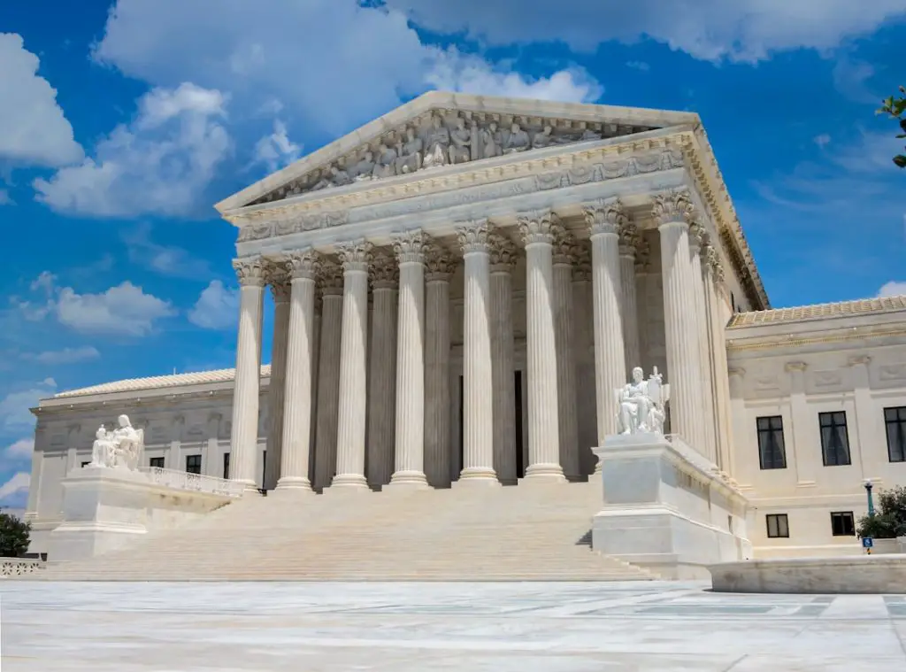
The typography of the United States Supreme Court reflects two related worlds: the strictly regulated type used in legal filings and the formal visual language used in the Court’s public identity. Although many people associate legal documents with dense blocks of Times New Roman, Supreme Court practice has its own traditions, especially the preference for the Century type family in printed briefs.
TLDR: The U.S. Supreme Court generally requires briefs to use a font from the Century family, most commonly Century Schoolbook or a related Century style. This choice supports readability, consistency, and a formal appearance in printed legal documents. The Court’s branding, including its seal and architectural inscriptions, relies on classical serif lettering rather than a single downloadable “Supreme Court font.” Legal professionals should always follow the Court’s current rules rather than relying on general design assumptions.
Why Typography Matters at the Supreme Court
Typography in Supreme Court materials is not merely decorative. It affects readability, credibility, pagination, and compliance. Supreme Court briefs are read by justices, clerks, opposing counsel, journalists, scholars, and the public. A clear typographic system helps make complicated legal arguments easier to process.
Legal documents also depend on uniformity. If each party used radically different fonts, spacing, and sizes, page limits would become easier to manipulate and harder to enforce. A compact font could allow one party to squeeze more argument into the same number of pages, while a wider font could make another filing appear longer than it really is. The Court’s typography rules help create a fair and predictable standard.

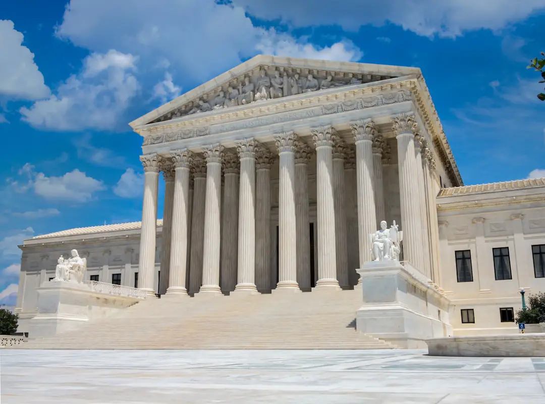
The Main Font Used in Supreme Court Briefs
The typeface most often associated with Supreme Court briefs is Century Schoolbook, part of the broader Century family. Supreme Court rules have traditionally required printed booklet-format briefs to be set in a typeface from the Century family, such as Century Expanded, New Century Schoolbook, or Century Schoolbook.
Century typefaces are serif fonts, meaning the letters have small finishing strokes at the ends of their forms. These details help guide the eye across lines of text, especially in long-form reading. In legal documents, where paragraphs can be lengthy and citations frequent, that readability is essential.
Century Schoolbook is especially popular because it has a generous x-height, open letterforms, and a sturdy appearance. It was originally developed for educational publishing, which explains its straightforward and highly legible character. In a Supreme Court brief, it creates a tone that is both formal and accessible.
Common Supreme Court Font Requirements
Although exact requirements can change and should always be checked against the current Supreme Court Rules, standard expectations for printed briefs often include the following:
- Typeface: A font from the Century family is commonly required for booklet-format briefs.
- Body text size: The main text is typically set in 12-point type.
- Footnote size: Footnotes are commonly set smaller, often around 10-point type.
- Leading: The space between lines must allow comfortable reading and may be regulated by rule.
- Margins and booklet layout: Supreme Court briefs often follow a specialized booklet format rather than a standard office-memo layout.
These rules exist to ensure that briefs are readable, professional, and comparable from one case to another. A filer should not treat typography as a casual design choice. At the Supreme Court level, typography is part of procedural compliance.
Century Schoolbook vs. Times New Roman
Many lawyers are familiar with Times New Roman, which is widely used in legal practice, academic writing, and government documents. However, Times New Roman is not the typeface most closely associated with Supreme Court booklet briefs. While it may appear in other legal contexts, the Supreme Court’s preference for Century-family fonts gives its filings a distinctive look.
Compared with Times New Roman, Century Schoolbook is wider, rounder, and often easier to read in dense passages. It uses more horizontal space, which can affect page count. That is one reason compliance matters: font choice can meaningfully change how much text fits into a filing.
From a design perspective, Times New Roman feels compact and newspaper-like, while Century Schoolbook feels more open, institutional, and bookish. For Supreme Court briefs, that book-like character is appropriate because the documents are printed and bound in a format resembling a small legal volume.
Image not found in postmetaTypography in Supreme Court Opinions
Supreme Court opinions, slip opinions, orders, and official publications have their own formatting traditions. These materials are produced by the Court and its publishing systems, not by outside litigants. Their typography is designed for legal citation, archival stability, and broad public access.
The Court’s published opinions often use traditional serif typefaces suitable for long reading. The formatting is restrained, with emphasis placed on hierarchy: case names, syllabus headings, majority opinions, concurrences, dissents, footnotes, and citations. The result is not flashy, but it is highly structured.
In this context, typography supports legal authority. A Supreme Court opinion must appear stable and official. Decorative fonts, novelty type, and dramatic branding choices would conflict with the seriousness of constitutional and statutory interpretation.
The Font of the Supreme Court Seal and Branding
The Supreme Court’s visual identity is not based on a single modern brand font in the same way a corporation might use one. Instead, its branding relies on classical legal symbolism: the seal, the building, carved inscriptions, formal stationery, and restrained government design.
The Supreme Court seal features traditional lettering arranged around the emblem. Its appearance is closer to engraved or classical Roman serif lettering than to a commercial font selected for marketing. Similar visual cues appear in architectural inscriptions and official materials. These letterforms communicate permanence, dignity, and institutional authority.
Designers attempting to create Supreme Court-inspired materials should therefore avoid assuming that there is one official “Supreme Court font” available for general use. A more accurate approach is to study the characteristics of the Court’s typography: serif forms, balanced spacing, capital letters, conservative hierarchy, and formal proportions.
Image not found in postmetaBest Practices for Legal Document Typography
For legal professionals filing in or referencing the Supreme Court, the most important principle is simple: follow the official rules first. Visual polish is valuable only if the document is compliant.
Good legal typography generally includes the following practices:
- Use the required typeface. If Supreme Court rules require a Century-family font, a substitute should not be used without confirming acceptability.
- Preserve readable spacing. Crowded lines make legal arguments harder to follow and can create compliance issues.
- Use italics carefully. Italics are useful for case names, emphasis, and certain citation conventions, but excessive emphasis weakens readability.
- Create clear hierarchy. Headings, subheadings, footnotes, and appendices should be visually distinct without becoming ornamental.
- Avoid novelty fonts. Supreme Court documents should appear serious, neutral, and professional.
Digital Documents and Accessibility
Modern Supreme Court practice also involves electronic filing and digital access. Typography must therefore work both on paper and on screens. A font that looks elegant in print but renders poorly in PDF form can reduce accessibility. Proper embedding of fonts, searchable text, and consistent formatting are important parts of modern legal document preparation.
Accessibility also favors predictable typefaces, sufficient contrast, and logical structure. Although Supreme Court typography is rooted in print tradition, its documents are now read on laptops, tablets, and phones by a wide audience. A well-prepared legal PDF should respect both formal court rules and practical reading conditions.
Conclusion
The typography of the U.S. Supreme Court is defined by restraint, readability, and tradition. In legal briefs, the Century family, especially Century Schoolbook, plays a central role. In the Court’s broader branding, classical serif lettering and institutional design carry the sense of permanence associated with the nation’s highest court.
For lawyers, typographers, and legal publishers, the lesson is clear: Supreme Court typography is not about visual experimentation. It is about clarity, authority, and respect for procedural rules. A properly formatted document signals professionalism before a single argument is read.
FAQ
What font does the U.S. Supreme Court require for briefs?
The Court commonly requires a font from the Century family for booklet-format briefs. Century Schoolbook and New Century Schoolbook are frequently associated with Supreme Court filings.
Is Times New Roman allowed in Supreme Court briefs?
Times New Roman is common in many legal settings, but it is not the standard font generally associated with Supreme Court booklet briefs. Filers should check the current Supreme Court Rules before using it.
Why does the Supreme Court use Century-style fonts?
Century fonts are readable, formal, and suitable for long printed documents. They also help maintain consistency across briefs submitted by different parties.
Is there an official Supreme Court branding font?
The Court does not function like a commercial brand with a single public marketing font. Its visual identity relies on classical serif lettering, the official seal, architecture, and restrained government design.
What size font is used in Supreme Court briefs?
The main body text is commonly set in 12-point type, with footnotes often smaller. Exact formatting requirements should always be confirmed in the current rules.
Can a legal brief use decorative typography?
Decorative typography is inappropriate for Supreme Court filings. Legal documents should use compliant, readable, and professional typefaces that support the argument rather than distract from it.