Email marketing is one of the most popular ways of promotion that most businesses use.
If you have no experience in email marketing, look no further. This post will help you to compose a winning email for your customers. Scroll down below and discover how to increase sales with the help of email marketing.
How To Write for Email Marketing
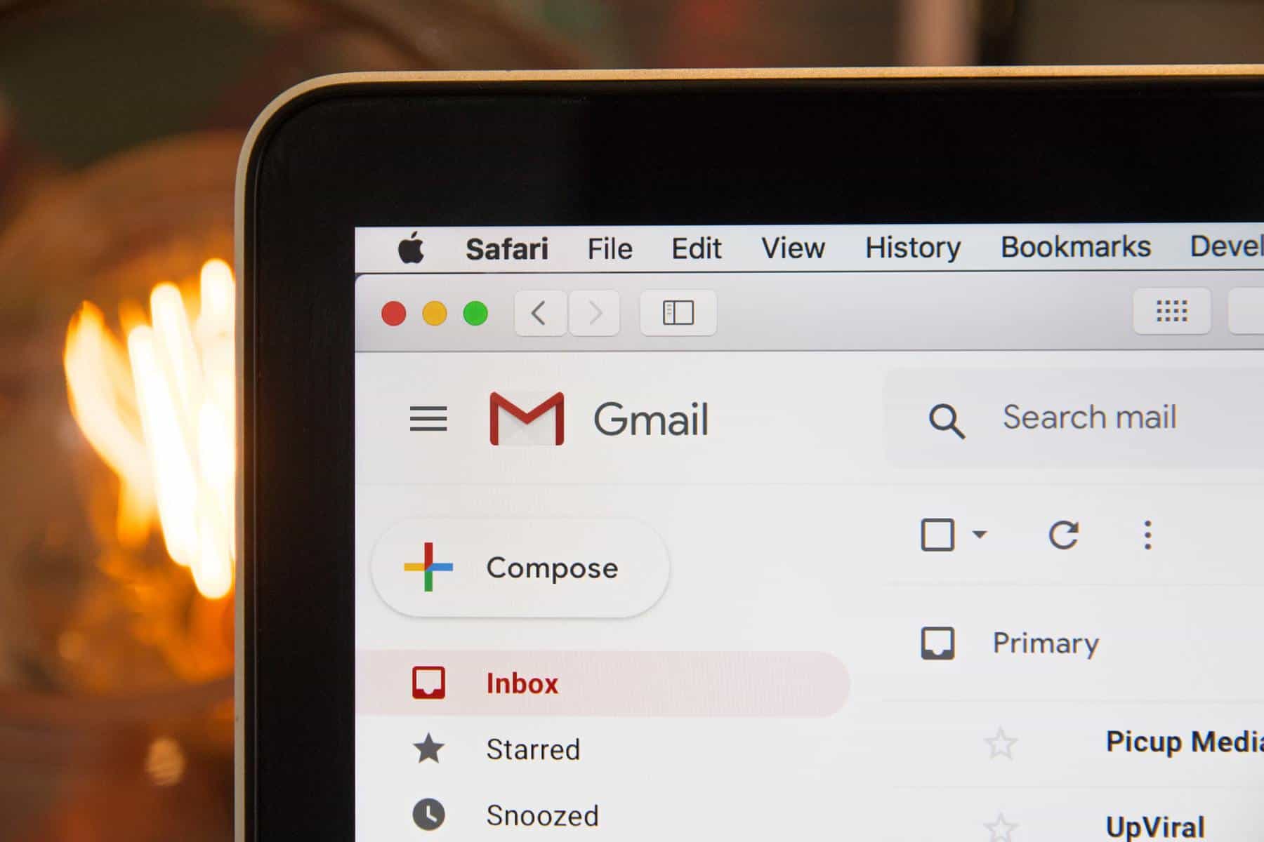
Text is the crucial component of emails, and it’s vital to use words properly to engage clients and persuade them of the advantages of your products or services.
Subject Line
The subject line is the first thing that users see, receiving a new email. It should stir some emotion and drive users to check the new email. Remember, your emails’ subject line should be relevant to the message that you want to deliver. Here are some examples of killer subject lines:
- “Limited offer for you is expiring.”
- “Ten things to do for achieving your goal.”
- “Still expecting the best value offer? Check this out!”
If you experience a lack of creativity and want skilled writers to create winning letters for your email marketing campaigns, don’t be shy about getting help online. Feel free to examine essay writing service reviews to find the best writing company on the Internet.
Preview Text
These days, a lot of email apps and services show the first sentence from letters as a preview message. Also, the preview text appears in notifications on smartphones.
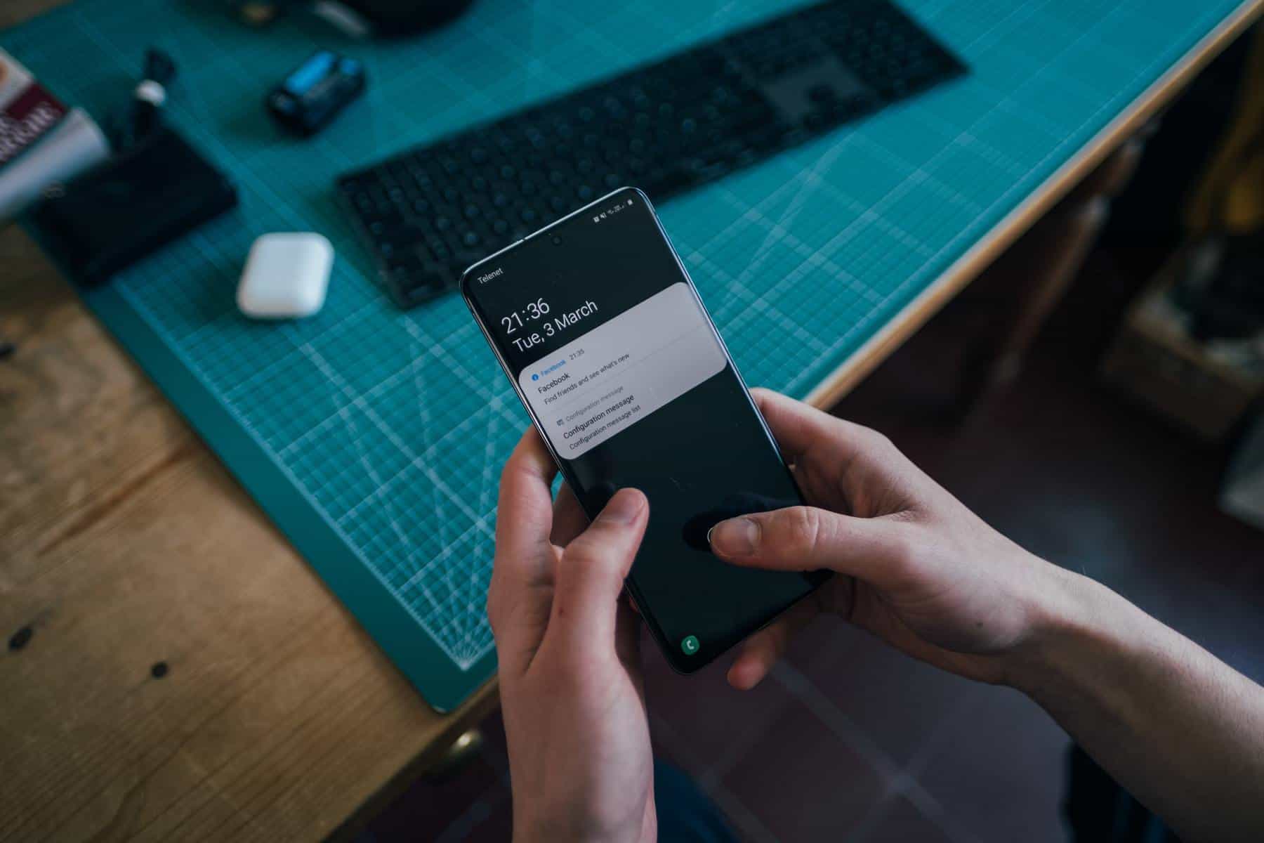
Therefore, you need to make the first sentence in your message catchy to attract users’ attention and drive them to open your message. It can vary from 40 to 150 characters.
Formatting
A promotional email isn’t an essay. Composing a letter, you need to make it convenient to read. Try to keep it short; it should be similar to a small web page that attracts users’ attention and leads them to your site.
Feel free to format your text, add bullet lists, change the font color, and write in caps. However, don’t overdo with capitalization to avoid “shouting” in your message.
Call To Action
You shouldn’t forget about adding links and buttons into your advertising emails to lead users to a promotion offer. Otherwise, your email marketing campaign will fail. Users won’t check your offer if there are no direct links. A bright color should highlight buttons or links to attract users’ attention.
Personalization
It’s not a secret that targeted emails have a larger open rate. Thereupon, if you want your marketing campaign to have high performance, you need to personalize your letters.

As an illustration, children or adults won’t be highly interested in checking out the latest EssayPro reviews. However, students always want to keep themselves updated about online services that help study with no hassle.
Unsubscribe Button
Bear in mind that people don’t like receiving spam messages. Therefore, you always need to add the unsubscribe link to the bottom of your letter. If you forget to do this, people will likely block you and won’t receive any further emails.
How To Pick and Use Graphics
These days, email clients support different types of graphics that help make messages more engaging. Keep on reading the post and discover how to supplement your letter with images.
Background
Using images as a background is a cool feature that allows people to make letters stand out from others. However, the technology works differently on various platforms and devices.
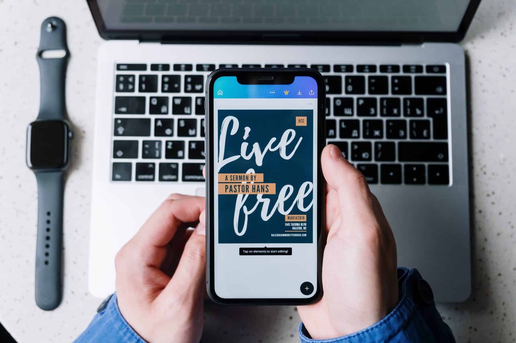
Therefore, you need to test your message on multiple devices before launching a marketing campaign. For instance, the image background feature doesn’t work in Outlook at all.
Size and Format
Low-resolution images in your email won’t engage users. Therefore, it’s vital to use only high-quality pictures in your letters. The best ways to get graphics for email marketing messages are:
- stock images,
- self-made shots,
- graphics from freelancers or users.
You can use PNG, JPG, and rarely GIF animations. All email services support these formats. The best size for images is up to 600px width, and 200px height. However, if you want your email to look perfect on high-definition displays, feel free to add images that are twice bigger than their placeholders.
Image-To-Text Ratio
You should be careful with using a large number of images in your emails. A message containing many pictures and a few sentences of text will likely be marked as spam. Therefore, you need to follow a corresponding image-to-text ratio to make it look perfect.
The proportion of images should not exceed 50% of the content. The best value of pictures is from 20% to 50%.
To fill the rest 50%-80% of content with engaging text, reach StudyBay, a top-rate writing company.
Important Thing
Note, users may open your email on a large-screen computer or a small smartphone, and it should look perfect on any device. Therefore, always use email marketing platforms to build and send promotional emails. Most of the services have advanced builders that allow you to create a fully responsive email by dragging items on a screen.
Otherwise, you can hire a web developer or create a fully responsive email by yourself. If so, you should be familiar with HTML and CSS markup languages.

