

Creating visual branding is a lot more significant than you probably think. It greatly affects how people perceive you and your services.
Establishing this means deciding how you will put yourself out there and how the targeted audience will see you. It’s important to have your goals thoroughly planned out to be able to begin developing your visual identity. This can be achieved by tackling it yourself, or by collaborating with a brand identity firm to get guidelines from professionals and ensure your success.
It’s also important to have an easy way to organize, find, and share your brand files and assets. And that can easily be achieved using a tool like Brandox.

Brandox is a platform that enables you to manage, organize, and share files, images, etc. in the easiest way possible. In a nutshell, it is a user-friendly visual platform that works great regardless of file size or quality and will even let you set access rights as you wish.
But enough about Brandox, let’s get back to the do’s and don’ts of visual branding.
We’re going to break this into simple steps consisting of what to do and what not to do when you’re creating or rebranding a visual identity. It also concerns such a website as Thesis Geek.
1. Logo
The absolute first thing to launch with is a logo which needs to envelop what you offer in a single image or illustration. This way you can easily keep adding subsequent elements based on your logo’s design.
Your logo will be found on your website, business cards, merch – everywhere.
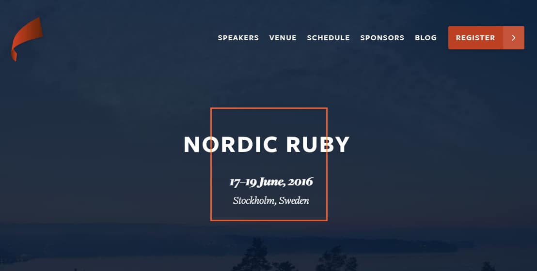
Do
![]()
Think simplicity, crispness, memorability. You’d be surprised how many successful logos consist of only a few simple lines. A well-made logo is supposed to be remembered instantly when someone mentions your brand name. For example, if someone asked you to draw them the Nike logo, you would probably be able to do it instantly since it’s really only a tick – yet, a very successful visual brand.
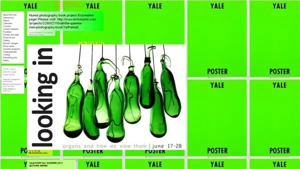
Don’t
![]()
Don’t be afraid of empty space, this is a common mistake since emptiness can communicate a lot. Moreover, overcrowding your logo with elements will only bring confusion to customers and a great deal of trouble for you.
It is crucial to visualize how your logo will look on a website, t-shirt, and a pen, a complicated one won’t fit all. Most importantly, don’t allow users to get the exact opposite feeling from looking at your logo than the one they should actually get.
2. Color
You communicate the feelings and tone of your brand via color, so it’s a good idea to put a lot of effort into your color palette. There’s a whole psychological aspect to it; how people are affected by different colors.
You can guide yourself with this when deciding what you want customers to feel when they look at your brand while still maintaining your brand’s authenticity.
Do
Consider different color systems and combinations. For example, purple and yellow might seem too much, but they’re actually complementary and can look really good if executed well; giving both a classy and cheerful tone to your brand. Nevertheless, do make sure the palette cooperates properly and that every element is legible, so be careful how you contrast colors.
Don’t
Don’t jump into it and choose certain colors just because they look nice or pretty. Naturally, aesthetic is important, but it’s not of much use if it doesn’t speak about what’s under the surface. Additionally, it’s not recommended to use flashy, neon, or very bright colors unless it’s for some smaller elements in the right dose.
3. Typography
Regardless of what your branding stands for, it’s safe to assume that it will consist of text that will need styling. Maybe your logo also has a word attached to it, or it is a word. Nevertheless, typography is a little more than just choosing the first font that looks good.
Do
There’s the option to create a custom font solely for your brand. Whether you’re somewhat of a designer yourself or if you hire someone – you wouldn’t have to worry about copyright, and you’d have the original font only for your visual identity.
Either way, keep legibility in mind and consider what certain types of letters, for example, serif and sans-serif represent and which fits your brand more.
Don’t

A big mistake would be using a random font and potentially getting sued, you obviously want to avoid this. Moreover, not every font is web-friendly or available everywhere and some might seem too generic and basic, so keeping an eye out for this is heavily recommended.
4. Photography
Photography might be one of the most underrated elements when it comes to brand identity since it’s practically impossible these days not to use images. Still, it’s very easy to do it incorrectly since it’s not talked about frequently.
Do

Including photos in your branding means you should be thinking about the three important aspects; relevance, interestingness, and attraction. The primary color in your photos will impact largely the rest of your visuals so ensure they correspond.
Consider creative cropping – images can appear very easy on the eyes if cropped the right way. Lastly, Photoshop is always a good idea for a few touch-ups.
Don’t

Avoid using generic photos that make customers feel far from your brand. If you’re using someone else’s photos, you might want to ask for permission from the author first.
Another thing that people still use but is rather outdated are sliders; rarely anyone has ambition and patience to browse through them and they just get unnecessary attention.
5. Visual Style
Visual design style pertains to various elements for potential use when creating a brand identity. It’s how you visualize data; videos, animations, icons, etc.
Do

Remember consistency, maintain everything in one style. Consider using illustrations and icons instead of text where you can and designing them yourself instead of copying generic ones, it will help you keep things original and come off pretty neat.
Don’t

Don’t use dynamic elements like videos or animations unless it’s crucial for your brand, otherwise, it will just attract too much attention without sending a message.
To Sum It Up
As long as you know the message and feeling you’re trying to communicate with your visual identity and apply it while creating it, you’ll be fine.
Black and white designs are always an option, often a good one, and horror vacui is not your friend – sometimes the simplest visuals are the ones leaving the biggest impact.
Along the way, do consult your friends and potential customers/users. It will let you see what you can’t yourself from another perspective which is very beneficial for your design. As this is not a simple task, you can always research some additional options, such as talking with a reliable digital marketing agency that can guide you in the right direction. Finally, remember that these visuals are the thing that comes to someone’s mind when mentioning your brand name.