

Are you in the process of creating your website but you got stuck and are looking for some pointers? Maybe you’re here just to see what website design is about out of curiosity or maybe you’re looking to start your very own first website but are not quite sure where to even begin?
It’s a good thing you’re here – now we can get started with listing the top 10 website design elements you should definitely not leave out during the creative process.
UX Design
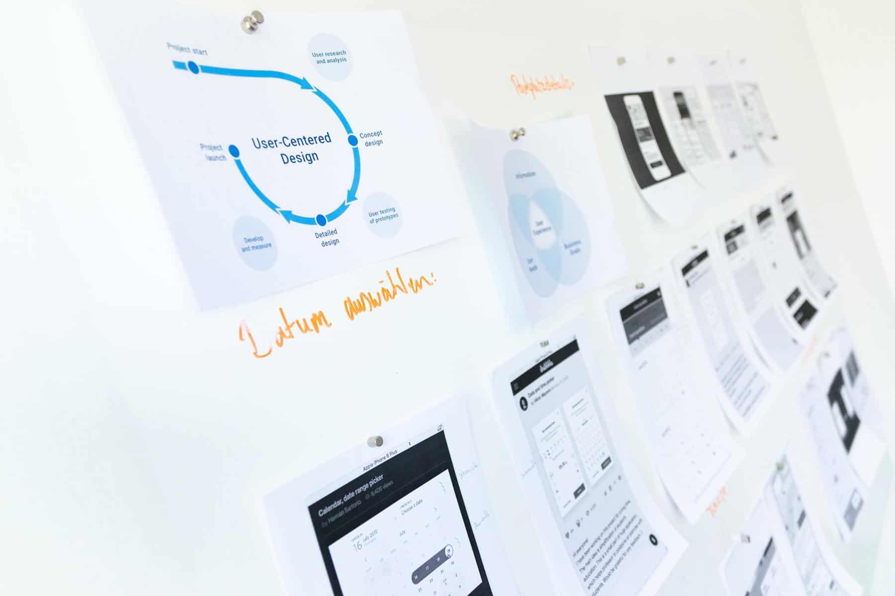
A popular mistake people tend to make when starting a website is jumping into aesthetic design, thinking it makes all the difference whereas it should come in last.
Instead, think about the people you want to see your website, what’s your targeted group, how old are they, how do they spend their time, what’s important to them and what could you do to make their user experience better?
Interview people, send out questionnaires, create personas of your ideal customers/viewers. Doing this step could determine your success with your website, depending on what your goal is.
Information Architecture / Content
Structuring important data is of crucial significance. Think about the information viewers will look for on your website and how you can make it easier for them to find it and interact with it.
Will they be able to find everything they need quickly and simply through navigation or are they going to have to dig through different pages until they get what they came for?
Nobody likes spending a lot of time struggling to find that one piece of information and it’s up to you to ensure this doesn’t happen on your site.
Layout
Upgrading your initial idea to a more precise layout is the next step. You can use famous rules such as the golden ratio or the rule of thirds, keeping in mind what naturally attracts the human eye the most.
Remember, you’re not going to end up sticking to your envisioned layout entirely. Instead, it’s really supposed to help you imagine how all the elements will fall into place because when you’re done with your layout, you can always just start dropping the elements inside.
Creating your website with a previously designed layout will help a lot, but everyone makes changes along the way, and exactly that is the point of it all – getting better!
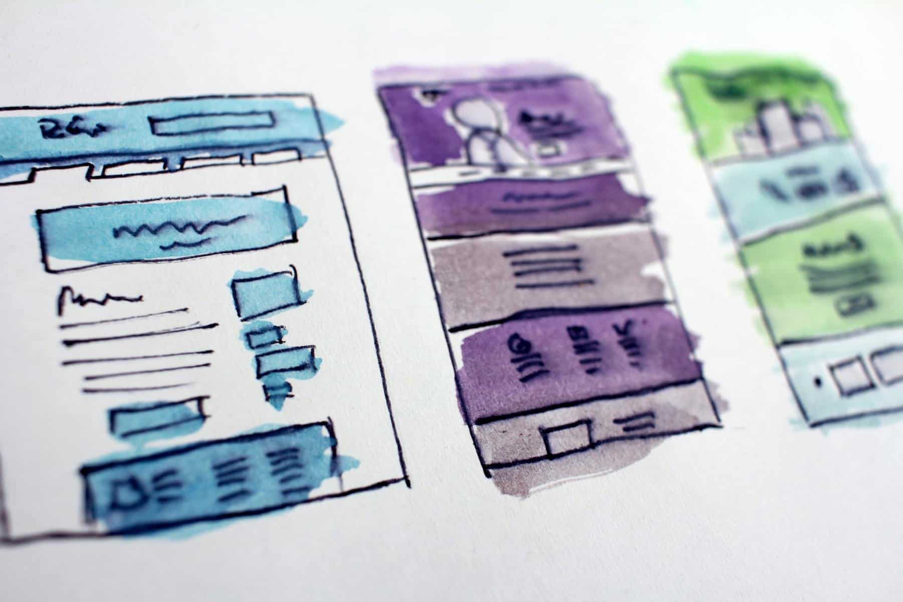
Wireframing
Having figured out your goals and acquainted yourself with your target audience, it’s time to move onto creating the first visual of your website.
Some practice paper and pen sketching before moving into the digital world and having tried it myself, I fully recommend this. Also, think about the element disposition. How many columns are you going to have, how wide, are you going to have any at all?
Header, footer, sidebars – give them all a few sketches until you’re satisfied.
Typography
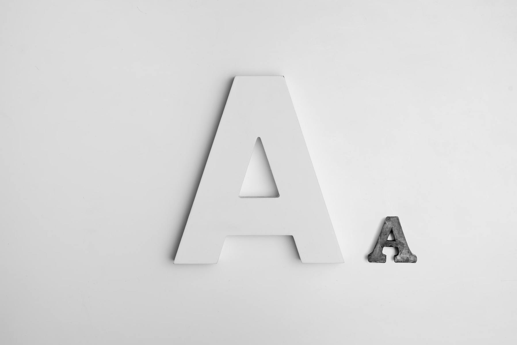
If you want most information on your website to be delivered through text (as opposed to photos or videos), then typography is probably more crucial than you think.
It’s not about just writing plain text in HTML; you need to ensure your text is legible, well-contrasted with the rest of the elements on your page, and of course, that it sends the message you want it to.
So pick the right font, play around with leading, kerning, and tracking until you tick all the boxes.
Navigation
Navigation is what guides viewers/visitors around a website and it is very important to remember the following regarding it; always make sure that a user, at any given point, knows exactly where they are on your page. Maybe with the help of an enlarged title or a different background in the navigation tab of the page they’re currently visiting.
For example, if your “Products” page is being visited at the moment, make sure the “Products” title is somehow highlighted in your navigation bar.
Also, think about what type of navigation would best fit your page; vertical, horizontal, sidebar, tabs, breadcrumbs – even though you’ve probably already visualized this when developing your layout.
Color
The psychology of color is a very broad and complex area, but there are some basic guidelines on how the human eye reacts to different colors that can help you decide which ones to use and where to use them;
- Red – passion, anger, speed, imposition
- Yellow – optimism, joy, intellect, imagination, contentment, understanding
- Orange – happiness, security, strength, independence, balance, ambition
- Blue – peace, harmony, creativity, trust, safety, stability, freedom
- Purple – luxury, power, respect, pride, impact, nobility
- Green – relaxation, development, safety, stability, cold, freshness
- Black – elegancy, formality, depth, mystery, secrecy, wealth
You can aid yourself with a color guide, literally, any graphics program nowadays has one integrated.
Forms / Links / Tables
Think about creating a user-friendly form in case you’re going to have a login or maybe a checkout system. Label alignment (vertical, horizontal, left, or right-justified) will significantly help users fill the form out with no unnecessary confusion, as long as you group the form in proper order.
When it comes to links, make sure they’re not static. Make a link change its color once you hover over it, make it underlined when you click it, and so on.
As for tables, you’ll find them very useful in some situations and believe or not, it’s a frequently used trick for proper element placement since you have to think less about positioning.
Photos
Imagine creating a website without it containing at least several photos – almost impossible nowadays. But you have to make sure your photos are relevant, attractive (this is especially important for photos of food for example) and interesting enough to catch a viewer’s eye.
If you’re not going to use your own photos, you can get free ones from literally hundreds (and probably more) of different stock photo websites.
Experiment with cropping to get unique effects or edit them in Photoshop (or another editing/graphics program) to your desires, but of course, make sure they blend in with the rest of your site!
Backgrounds / Effects
Having completed all these previous steps, you probably have an almost fully-developed website ready to launch. However, you’re not there just yet.
Maybe it’s not what fits your specific site and that’s fine, but think about how certain 3D, shadow or gradient effects could light up some aspects of your design. Would a soft floral print work well for your background or are you keeping it plain white?
Minimalistic website design, contrary to the popular opinion, really does not mean less success just because someone wasn’t afraid of empty space. Instead, it could benefit your website majorly!
Conclusion
All in all, while this may seem like a lot of work, it does pay off when you see the results! You’ll find that a structured plan like this one helps everything move faster with time rather than blindly creating elements on top of elements for your website design.
As long as you keep in mind that it’s really all about what people want to do, see and read on your website, you’ll do a great job with your design.