
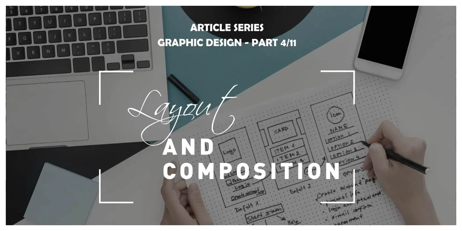
Layout & Composition is the fourth article in the Ultimate Graphic and Web Design Basics Guide. It was meant for those looking to get their career started as designers, but also for those that are interested in the design process. Within the following series of the nine articles, and two “bonus tips” articles, we will cover everything you need to know to get started. Stay tuned for the following articles:
- The Basics of Graphic Design: What It Is, and What’s It For?
- Color Theory & Psychology
- Typography: How to choose the proper font
- Layout & Composition
- Photography in Graphic Design
- Branding & Logo Design
- How Graphic Design Translates into Web Design?
- User Experience – How to get it right?
- Modern Trends in Design
- Bonus tip: How to find your first gig
- Bonus tip: How to work with clients
Stay tuned for the full series!
Layout and composition are two different terms, but they work together harmoniously. The composition is something crucial in any art form, whether it is design, painting, music, photography, you name it. It refers to the elements that make up a certain design/piece of artwork. The layout is the organization of those elements, the way they are laid out and arranged.
When your design has good layout and composition, it can enable your viewer to navigate through it easily and have a better understanding of it is about. People who aren’t really knowledgeable on layout and composition often undermine their importance, for that same reason, they are the ones who often fail to create beautiful and professional designs that will convey their message accurately.
A poor layout is something that will make or break your design. If good, it will appeal to people; if not, it will make them turn away from it, consciously or unconsciously.
The thing most designers struggle with is not the actual design, rather the layout. They struggle with it because most of them aren’t familiar with the rules and principles of layout and composition. To help you not be one of those designers, in this article, we are going to give you a brief introduction to those rules and principles and also the types of layouts you should be familiar with.
Principles of layout and composition
Proximity – Proximity is something that will allow you to define a relationship between elements in your content. Elements that are related should be grouped together, placed in near proximity. In the same way that being grouped together will show a relationship between elements, them being placed away from each other will show a lack of relationship.
White space – White space is space between your content that gives your content room to breathe and makes it easier to understand for the people viewing it. Having a good amount of white space is crucial for all compositions.
Alignment – To align something means to arrange it in a straight line or in correct relative positions. The key to using alignment is to use it consistently through your work. You can do it manually using grids and rulers, but all software tools you will be working with come with alignment tools.
Contrast – Contrast is having differentiations within your design elements. You can make contrast using different colors, sizes, fonts, etc.. With contrast, you can not only draw focus to a specific part of your design but the whole design in general by making it interesting using contrast.
Hierarchy – Its function is very similar to contrast since it is to emphasize or draw attention to something by making it bolder, bigger, different in order to show that it is important.
Repetition – Every good design project uses repetition. By repeating certain design elements like the color palette, header style, you make your project coherent. It is useful for practical reasons as well.
Rules of layout and composition
Grid – The grid is a staple of all popular designs. With a gird design, you can achieve a cleaner look and have an easier time with the design process since a grid predefines the spaces where you should put the content.
Focal point – A focal is something to draw and hold focus. It is usually the most important piece of information, but it can be anything, graphics, images, typography, or something else.

Balance – To achieve balance in your design, you can do a few things, equally, distribute elements on the grid, size your paragraphs similarly, have an equal amount of positive and negative space, and etc..
Rule of thirds – The rule of thirds implies dividing your design into three rows and three columns. By doing this, you can easily find the perfect place for your elements, which will usually be where the horizontal and vertical lines meet.
Rule of odds – The rule of odds is very helpful when you want to have a focal point, but you have more than one design element. The rule says that the number of those elements should be odd (3,5,7), so you can easily use one of them as the focal point and then arrange the rest of them around it.
Types of layouts
Mondrian layout – This layout was named after a Dutch painter famous for this style. It consists of forms like square, landscape, portrait, and all of them are parallel to the presentation field. With this layout, you can achieve a conceptual composition.
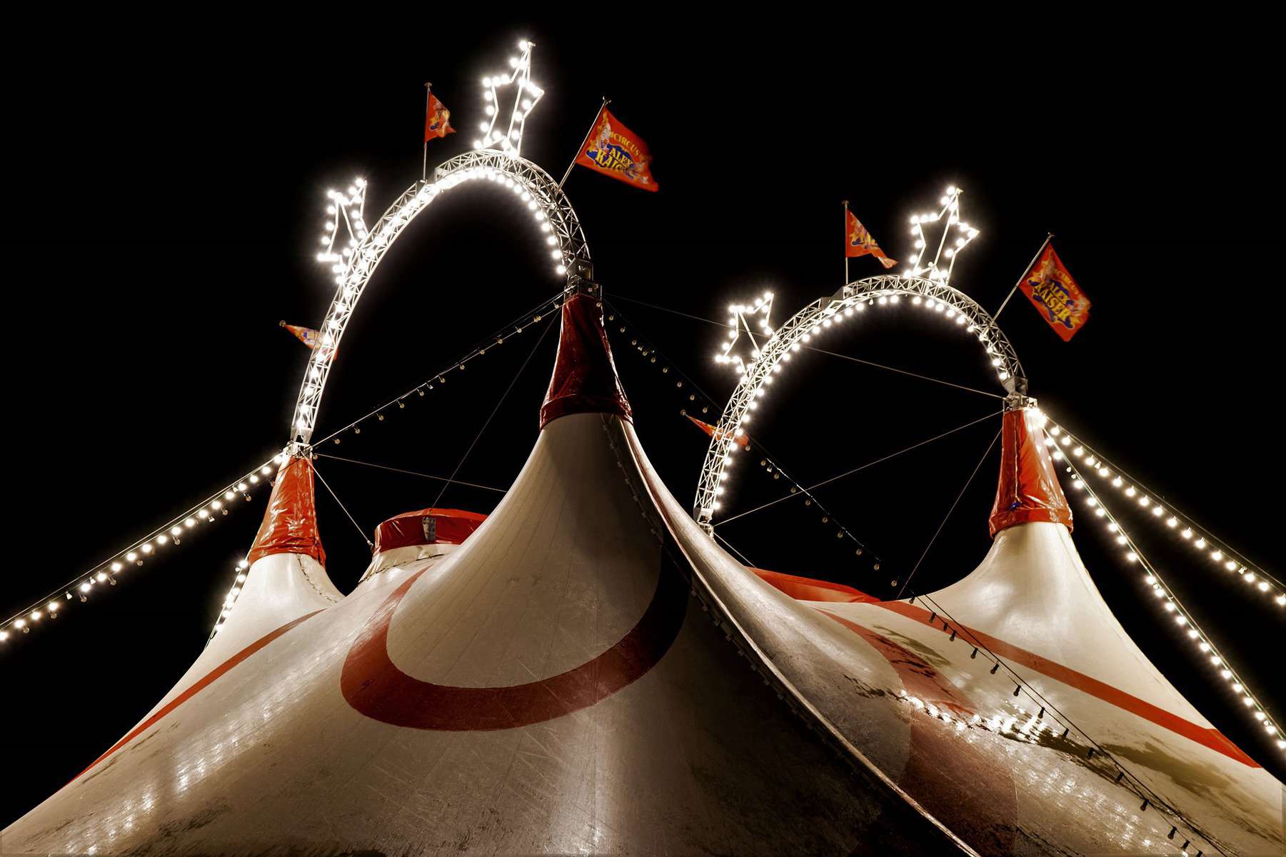
Circus layout – Not technically a layout, more an irregular or even random composition of elements.
Multi-panel layout – To achieve a multi-panel layout, you simply need to divide the layout into sections of various shapes.
Silhouette layout – This layout is characterized by highlights made using shadows, and the layout is typically made up of photos or illustrations.
Big-type layout – Big-type layouts are probably the most eye-catching and are used most often for headlines. They are made up of big and bold fonts.
Alphabet inspired layout – Creates an impression as if you are telling a story by arranging letters and/or numbers in various forms and sequences.
Why are layout and composition important?
A well-composed and laid out design will unify all your design elements; a bad design will simply highlight how those elements don’t work together.
Your layout and composition will let your clients know with ease and without many words, what your brand is about and what is its message if made well. This is an easy way to advertise, gain new customers, and influence the existing ones. Layout and composition are useful not only in your logo and advertising but also on your website. It will smoothly guide your site visitor into interacting with your site, increasing the profit you get from it.
Conclusion
A lot of people think their job is done once they decide on a logo, font, and color scheme, but it really isn’t. All those elements need to work in harmony with each other, be laid out appropriately and efficiently everywhere they are used. With the knowledge and tips you got from this article, you could easily do it yourself. You can follow these rules strictly, or be bold and experiment, but if you do decide to do that, don’t stray too far from the mentioned rules and principles. At the end of the day, they are there for a reason.