
Visual appeal matters a great deal. This is true, regardless of whether you run an online business or sell physical goods. But captivating photos, by themselves, do not always convey everything.
What better way to reaffirm this message than with a meme.
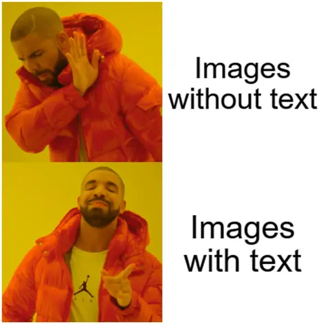
Memes are by far the best example of using text to enhance the appeal of an image. But from a business perspective, this is the lowest common denominator where photo meets text. There are plenty of other instances where images are used.
Merchandises like t-shirts, mugs, and caps are perhaps one of the most popular physical goods where visuals are used, and here too, text plays an important role in enhancing the appeal of the visual.
When it comes to online businesses, the text is used alongside pictures for a wide variety of use-cases – banner ads, in-content images, social media marketing, small business videos, and infographics, to mention a few. While the text is used in each of these cases, there is no standard way to enhance the appeal of the visual. The techniques and strategies you use can be very different, based on what you set out to do.
Here are a few tips to help you with this.
Contrasting Colors in T-shirts
Running an online T-shirt store is one of the most popular eCommerce businesses today. This business model is appealing for a number of reasons, including the ease of design and procurement, the low shipping costs incurred with shipping a t-shirt, and also the large market size.
However, one thing, besides product quality, that separates good t-shirt sellers from the others is the attention to visual detail. This is basically three things – how well the colors in the photo mix with the color of the t-shirt, the sync between the photo and the adjoining text, and finally, the color contrast between the photo and the text.
Take a look at this t-shirt, for example.
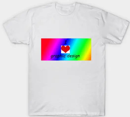
To be fair to the creators, this product has been designed intentionally to evoke irony. However, it is not uncommon for many t-shirt designers to make the same mistakes unintentionally. Firstly, the rich and bright colors of the central image do not blend with the plain white colored t-shirt. Secondly, the text inside the image is black, which does not offer a good contrast to the dark blue color in the background. The result is that the text is unreadable to most people passing by.
A good t-shirt design will blur the contrast between the color of the t-shirt and the color of the visual. It will also use the right fonts and font colors that can be seen by someone without having to squint their eye. Here are a few good examples of what good contrast can do to your t-shirt’s visual appeal.
Pairing the right fonts
The font you use for the text adjoining the picture can make or break your visual construct. This is for several reasons. Firstly, fonts demonstrate the ‘seriousness’ of your message. For instance, using Comic Sans for an announcement related to a health emergency can come across as highly unprofessional.

When it comes to picking a font, it is not just the font-image pairing that is important. It is also necessary to pair the font with the right alternatives within the content. This is especially relevant when it comes to website design, where the main font of the content needs to blend well with the font that is used elsewhere within the article as well as those used in the visuals.
Google Fonts has a long list of fonts you can pick from. Here is a great list of Google font pairings that you can implement for your website.
Text Location
Text that goes with the photo does not always have to be superimposed. Knowing when to superimpose text and when to place it adjacent to the image can be useful as a marketer. Superimposing text on the image, for the most part, serves an aesthetic purpose. This is great for t-shirts or when adding a featured image to your blog post.
If the content of the text has an impact on your KPIs – like in the case of an advertisement or an eCommerce product page, then it is a good idea to place the text adjacent to the image. This way, you still draw context to the visual while making sure that the textual message gets read and acted upon.
It is for this reason that when marketers design banner ads with text, they very often resort to a Call-To-Action (CTA) that looks like a button or a hyperlink (although they are all part of the same image). The objective is to make the text appear prominent and not as something that only adds to the aesthetic appeal of the visual.
With the rise of Pinterest and Instagram, the use of visuals is only going to increase. Knowing how to use text in your visuals can go a long way in maximizing marketing objectives without bringing down the aesthetic appeal of your campaigns.