
Charts are one of the rare, if not the only statistics tools that the layman can understand and use. This is because charts rely on our sight. Some research says that up to eighty percent of our perception is mediated through vision. Sight is our dominant sense and has been since humans exist. It has become even more since the invention of language. Since literacy has become standard, our sight has become even more important.
Vision is the process of deriving meaning from what is seen, and charts are a tool made to simplify that process.
They often use more than one comparison chart to make their point, thus adding to the growing presence of charts on the internet. That and their valuable contribution to the meme universe.
Why should you use charts?
One of the original functions of comparison charts was to make statistical research data understandable without looking at the hard numbers. They also simplify comparing the quality of different products – instead of reading whole paragraphs, a comparative chart delivers the gist of it in one glance.

So, a comparison chart draws a comparison between two or more phenomena on different parameters. They can provide both qualitative and quantitative information. Their use is most present in business and scientific presentations. On the internet, one of their most widespread uses is the comparison between different technological items. Advantages, disadvantages, prices, reviews, features, and more. Comparing all these can be such a drag that it can lead to choice paralysis. Comparison charts make the task of deciding what to buy much more manageable. Product charts have become a staple of technological brands.
What kind of charts are there?
They come in many different shapes. The first one, and the one most commonly used, is a pie chart. The second one, the product chart, is also known as a comparative sheet. Apart from these, the most widely used are line charts, bar charts, and histograms.
Whether you run an eStore and want to show off your product’s specs, or write an informative blog with research on a certain subject, charts will come in handy, if not mandatory.
Luckily, for your most basic, low-tier chart needs, there are easy solutions. You can get away with making comparison sheets by yourself, either drawing them or using different “insert table” options to make them work. Excel has its own chart menu, where you can choose from a variety of different chart types and manage templates.
Online services for creating charts
There are a lot of free charts providing services just a few clicks away. Sites like Canva and Visme offer quick, one-time chart designs, and some even offer interactive chart templates for you to use. This is great if you are trying to climb the SEO ladder. Most marketers agree that interactive content draws more attention and puts your website ahead of the competition.
Plus Charts
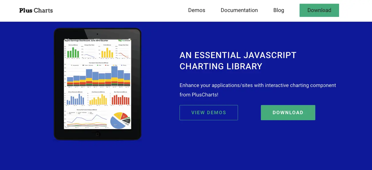
Plus charts is a free javascript charting library which supports bar, column, line, area, spline, pie and doughnut charts. Their demos are available on any device and are very easy to set up.
Venngage
Venngage is a popular and easy to use infographic creation station. Its goal is to offer professional-quality infographic designs for people who do not specialize in web design. The main focus of their brand is user-friendly simplicity with on-point results.
They offer three plan levels, as most design services offer: the free one, premium for individual users, and one for businesses and organizations. The premium plan usually offers more content, more photos, and design themes.
Venngage promises to help you become a design wizard in a few clicks. Regarding that, they offer a monthly and a yearly billed education plan.
Visme
A fierce competitor to Venngage is Visme. Visme puts a bigger accent on infographics, presentations, and visual content. They have set out to help you “speak visually”. They have formed a customer base in both business and education, as products are often used in school and educational environments. This is why they have created a separate plan for educational purposes.
They offer three educational plans:
- One free, for students to help with school presentations.
- One for educators, which contains a Slide Library, advanced privacy control settings, and an ability to record classes.
- A custom plan for Schools and Universities that clients can negotiate.
Business plans, in general, contains management options that other plans don’t. This features permission options, user management, and additional security. Visme’s most advanced business plan called Enterprise allows the creation of a custom Sub-domain.
Stockcharts
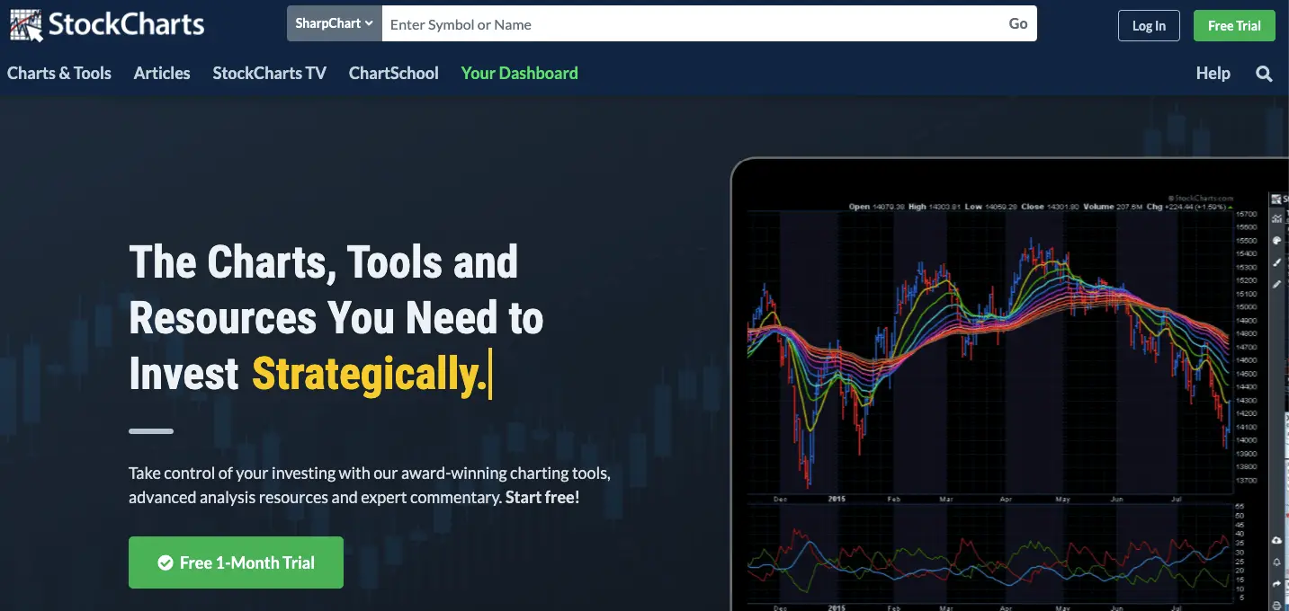
Stockcharts have branded their services as a toolkit for investors. They focus on advanced charts that are made to organize stock data. Their niche is the market, so the toolkit contains scanning tools for recognizing the next best investment and technical alerts that will notify you when it is a good time to sell.
Their website also contains a “ChartSchool” which is a library of any and all information regarding statistics, market research, and of course, how to implement all that data into your charts. Instructional videos and other consulting and support services are included.
Their plans are arranged a little differently. There are four plans: Free, Basic, Extra, and Pro. The options they differ in are different than those of Visme and Vengage, seeing that their functions are made for a different purpose.
Back to You
Charts are here even if you don’t even recognize them as such. They are the go-to-data presentation tool. They can be simple and used for humor, or in the case of Stockcharts product, they can have a life of their own. Knowing your way around designing, and maybe even more important, choosing the right chart will help you organize your data and your thoughts. You will thank yourself, and your audience certainly will too.