
Websites have a life of their own. And even though we usually look at them as a means to fulfill our goals, the truth is that for them to do their magic they need to be perceived as some sort of a venture.
If you don’t invest in making the website concurrent and up to date, your website won’t grow. Not only will it stop growing, but you will also probably lose relevancy. Why? Well, because somebody else is doing their best to meet the needs of internet users.
This doesn’t mean that people are out to get “your share of the pie”, instead, it’s just how it works.
One thing that will keep you in the game and in the leading position is having a well-thought-out design that engages with the audience. And here are some great examples of exactly that.
1. Slavery Footprint – Simplicity and positivity
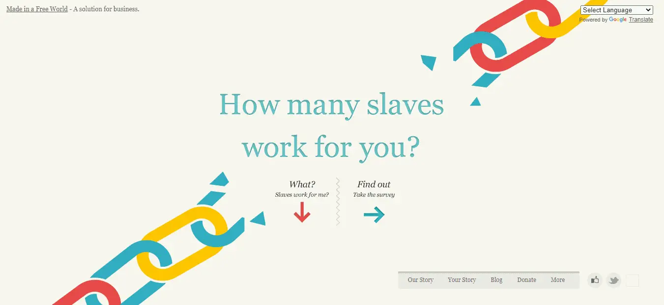
Slavery Footprint has been around for a while. It is a non-profit organization that builds awareness about modern-day slavery. This of course is an important subject and a very heavy one.
The thought of slavery still being a reality for the lives of many today is extremely distressing. And this is where Slavery Footprint communicates its authority in the field.
Instead of giving in to the distress impulse and organizing their website around the horrors of slavery, they present themselves as the organization that CAN handle this job.
Using a very simple front page design with a chain that is broken in the middle, sends a clear message – we are here to change this, and we can already imagine a better society.
2. Hello Monday – Cute, memorable characters
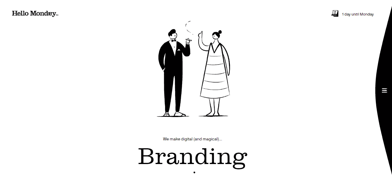
Hello Monday use ongoing automation for their frontpage. And exactly this is becoming more and more popular in 2020. Mostly because it shows that you are respecting the fact that we are predominantly visual creatures in an increasingly “visual” age.
But still, this is very easy to overdo. Even though it is a great design recommendation for a website in 2020, it has to have context.
The Hello Monday frontpage features simple black and white characters going through different transformations. And since Hello Monday is a creative digital studio, most of their work is in the field of design.
Those characters on the frontpage are representing just that – the different possibilities of design that Hello Monday has to offer.
The primary “liquid” quality of the characters is transposed on all the different functions of the websites such as the menus. This makes it a great example of ongoing automation that isn’t overdone.
3. Answer The Public – Humane humor
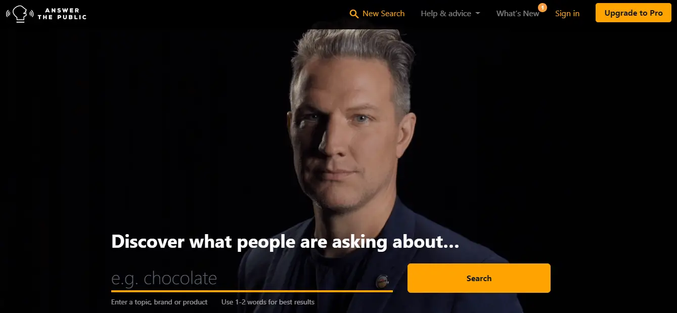
Answer The Public is a website dedicated to SEO keyword research. The site is pretty simple because it has only one task to solve – help you find your keywords.
Right above the search bar stands a person. The character changes on a regular basis and each one has a distinct presence. These people are great actors, encouraging you in different humorous ways to start your search.
Sometimes it’s a smug businessman challenging you to do better work than him. Sometimes it is a frustrated bald man who just wants to get it over with.
This is a great all-around, functional, funny, and engaging aesthetic that motivates you to work. And not only that, the search results generated by the site are spread out in a series of circles and organized in a gradient way within the circles.
4. Feedmusic – Beautiful abstraction
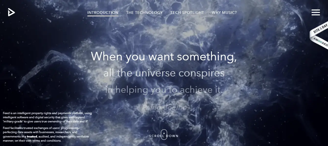
Feedmusic is a platform for property rights and payments regarding music. Their design does not coincide with their mission in any particular way, but it doesn’t imply much else.
The beautiful animation of a “stardust DNA coil” slowly turning in an “A Space Odyssey” manner is reason enough to visit the site and spend time on it. And still, it doesn’t take away too much from what the business has to offer.
The “Beautiful abstraction” principle continues on other pages of the site, changing from dispersed atoms to formations being governed by the movement of your mouse.
The animations are slow, almost hypnotic, and the change from page to page is so smoothly slow that it’s almost relaxing.
5. Bruno Simon – Show your strengths
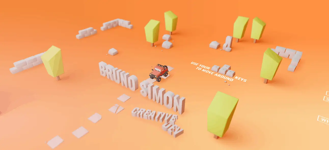
Bruno Simon is a creative developer. This means that most users online are not in need of his services.
For a creative developer, their website is effectively their portfolio. Meaning if you are looking for a creative developer and you want to see what they can do, you usually go and see what they have done before.
Bruno Simon switches this up a little bit. His website functions as a game. And while games on the front page are nothing new in any sense, this is a peculiar example.
It is not just a fun game that you play for a while and then continue on with your business on the site. Instead, the only way for you to explore the site is by playing the game.
By driving a car from checkpoint to checkpoint you browse his portfolio. That way you are seeing what he has done before, and are continuously experiencing what he can do.
You can also challenge the abilities of the car while you are browsing, by hitting boxes and whatnot. This gives you the benefit of trying out the product instead of just looking at the portfolio.
This a very intricate and high-level example of web development, but this principle can be used in any other scenario, just with a little less ambition if needed.
6. Simply Chocolate – Bold Product Placement
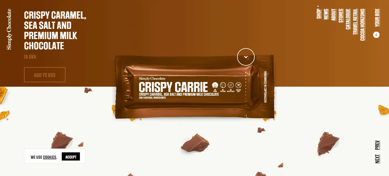
Simply Chocolate is a great example of branding done well. Everything about this brand is to the point – they are even named Simply Chocolate for god’s sake. And their web design follows this attitude down to a T.
As soon as you open the website, you are in the store, and a huge chocolate bar is staring at you and tempting you. The chocolate bars are almost popping out of the screen, with nothing more than the name of each chocolate and a “Add to Cart” button.
The visuals are very convincing, and the packages are also one color only. This is a great example of how to be minimalist but very bold and assertive at the same time.
Most brands take the minimalist trend and use it in a quiet humble approach. There is nothing wrong with that and is a legitimate tactic for certain things. For example, boasting too much if you are a service provider might send out the wrong message.
But with Simply Chocolate this is not the case. They are keen on one thing only, to get to the gist of it – chocolate, simply chocolate.
Conclusion
There are many more examples of great design solutions, and seeing how fast the market is growing, things are only going to get more interesting.
If you are looking for new design ideas don’t be afraid to copy. Of course, stealing is one thing, but seeing what is getting the job done and following the same steps is another.
A great moto within the entrepreneur community is “if somebody is making money off it – so can you”. So, explore and don’t be afraid to get inspired and follow someone else’s lead.
Good Luck!