
Modern Trends in Design is the ninth article in the Ultimate Graphic and Web Design Basics Guide. It was meant for those looking to get their career started as designers, but also for those that are interested in the design process. Within the following series of the nine articles, and two “bonus tips” articles, we will cover everything you need to know to get started. Stay tuned for the following articles:
- The Basics of Graphic Design: What It Is, and What’s It For?
- Color Theory & Psychology
- Typography: How to choose the proper font
- Layout & Composition
- Photography in Graphic Design
- Branding & Logo Design
- How Graphic Design Translates into Web Design?
- User Experience – How to get it right?
- Modern Trends in Design
- Bonus tip: How to find your first gig
- Bonus tip: How to work with clients
Stay tuned for the full series!
Throughout our lives, we have been surrounded by graphic design, in adverts, art pieces, packaging, all over the internet. Graphic design isn’t something that popped up recently, its history is long, and it has gone through a number of trends during it. The trends that happened in graphic design were often a reflection of the current sentiment in society, and the way the designs were created changed with the advancements of technology.
No one can put an exact number on how many design trends emerged through history because only the most influential ones stay remembered; the others simply fall into oblivion. Some design trends had such a level of popularity that they stay remembered by the older generations to this day, just like we will remember the current popular design trends with nostalgia when they become just a part of design history.
For business owners, it’s important to be familiar with design trends, so you know if you are keeping up and how you compare to your competitors. For graphic design artists, being educated on this matter help them better understand what the designers of the past and present were/are trying to communicate and using which design elements. In this article, we will go back in time and see which trends dominated through history, which trends reign supreme today, and which trends we can always fall back on.
Graphic design trends through history
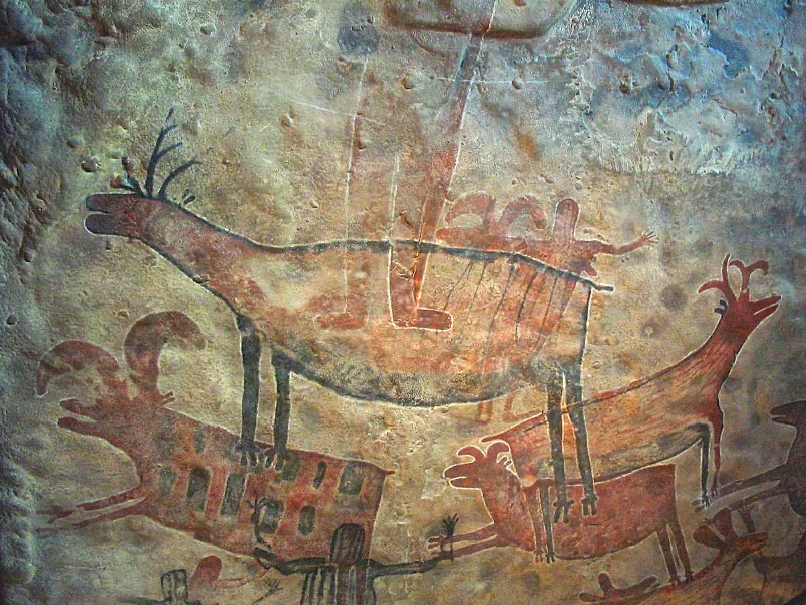
Cave paintings
When I said the graphic design had a long history, I meant a really long history. Its roots can be found as far back as our caveman days. Cave paintings represent the first form of communication. It was clear communication using simple visuals, which usually depicted the everyday life of our ancestors.
Sumerian written language
A language consisting of icons was the first form of a written language. The use of icons shows that humans have an instinct to express themselves visually, which explains why graphic design has such great importance for us.
Manuscripts
Manuscripts were present in a lot of cultures. From ancient Rome, Egypt, to as far as China. They were graphic designs made up of texts and images. Manuscripts continued into the middle ages in both European cultures and the Islamic world. The Islamic world had a large use of calligraphy since the depiction of any religious figures is forbidden. Calligraphy was their way of adding artistic value to the manuscripts, and a chance for highly talented scholars to set themselves apart.
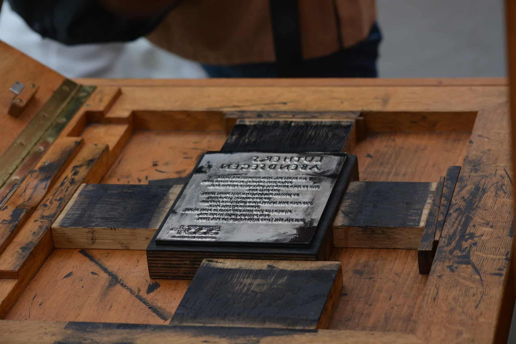
The start of printing
While everything mentioned thus far did serve as a foundation for graphic design, its pillars were set with the introduction of printing. The first mass-production printing machine was invented in China with a wooden relief printing technique. This enabled the creation of multiple copies of designs, texts, and images.
Printing in the industrial era
The invention of the Gutenberg printing press helped spread literature and the commercial use of graphic designs. Using the Gutenberg printing press, replications of designs and texts were made cheap and fast. This is the era in which the first logos and mass-produced ads with images were introduced.
Lithography and chromolithography
Lithography and later chromolithography (lithography, just with the addition of color) initiated the use of text and images in artworks and the first prints in color. The prints were used for everything from advertising, packaging, to home décor.
Art nouveau
Art nouveau was an artistic movement that was prominent in all areas of design, including graphic design. It was characterized by contoured lines and abstract shapes. The shapes were inspired by plant forms and were used to represent the subjects in an abstract way.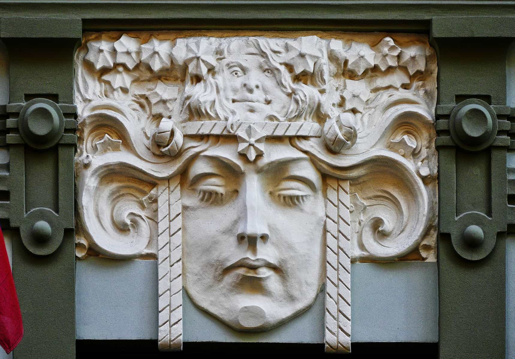
Modernism
Modernism was a direction away from the artistic styles of the past and towards the exploration of new techniques. Colors became bolder, while the shapes became simpler. The fonts used in this era were very modern for the time.
Postmodernism
During this period, there was an urge to explore new and different ideas as a sign of rebellion against common ideas and authority. It had an element of irony and skepticism to it, and the most recognizable trends from this era are pop art and conceptualism.
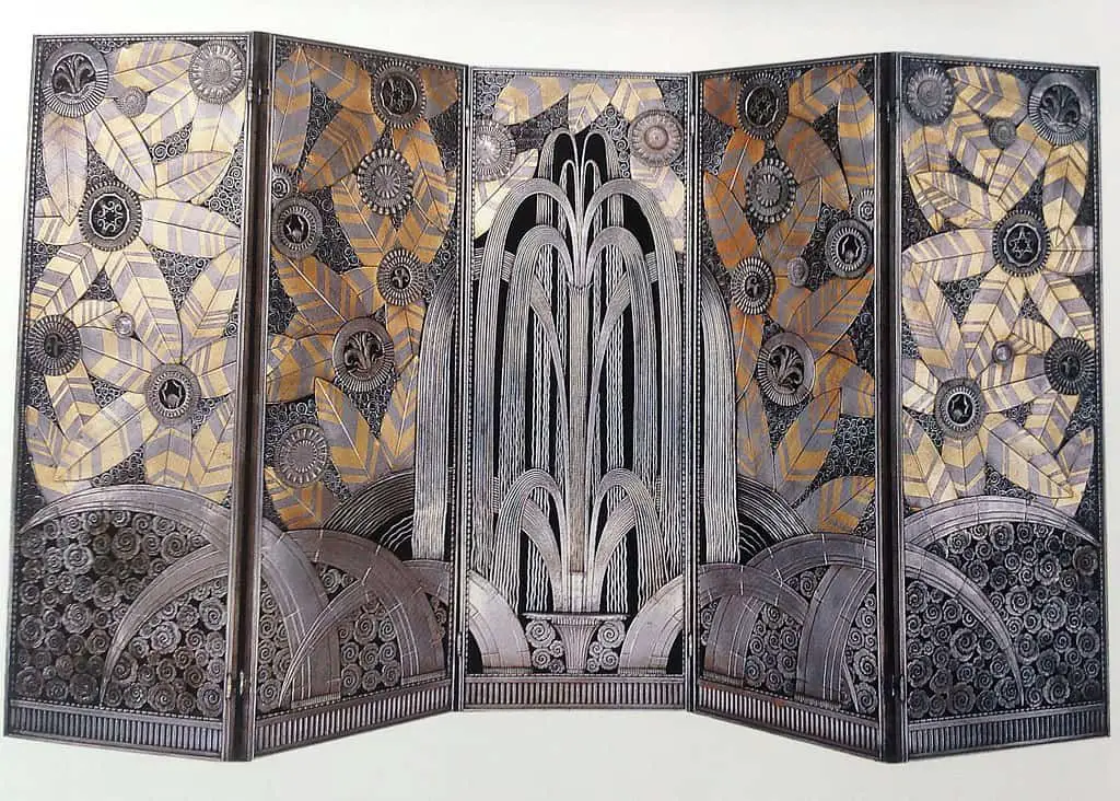
Art deco
Art deco is very famous for its abundance of geometric shapes, contrast, and symmetry. By using it, you can create a look that is very polished, sophisticated, and wealthy looking.
Swiss-style
Swiss-style or the international typographic style is a style where the art is more neutral and objective rather than full of individual expression and creativity. Characterized by a grid layout, clean design, and the use of photographs as imagery. This style is very popular among big multinational corporations.
Digital era
This really can’t be explained as one style since the designs created in the digital era are inspired by the leading trends.
The use of digital tools for the creation of graphic design allowed everyone to dive into the graphic design world with ease and reduced the number of handmade graphics being made to almost none.
In the digital era, complex designs can be created simply by almost anyone with access to design software.
Currently dominating trends
Open composition
The open composition is a design trend that ditches the framed finishes, making its art seem infinite. The design elements in an open composition seem to continue outside the borders of the design and off of the page. In a way, you were only presented with a portion of the design, and what might be beyond that portion, is open to interpretation. Open compositions are perfect for web design and in combinations with other design trends.
3D
Incorporating 3D elements in your designs makes them feel multidimensional and more realistic, immersing you further into it. 3D is not only limited to imagery and illustrations, but it can also be used in typography to help it serve better as a centerpiece. It is not rare to see the combination of open composition and 3D elements. In web design, 3D is often used to create an AR/VR experience.
Metallics
Metallics are used in graphic design often to create texture and contrast. They give off a sense of wealth, exclusivity, and luxury. When combined with typography, metallics can give emphasis to the type and lines. Using metallics could help take your design on another level. You can use it in a traditional way with a black or white surface or be a bit risky and combine it with other colors. If paired with the right color, metallics can look amazing.
Realism with flat design
When you put a realistic element on a flat surface, you can make the element look 3D and somewhat futuristic. This design is very popular on websites, in fashion editorials, and even packaging. It might seem fairly simple, but it does require some skill and lots of creativity.
Isometric designs
Isometric designs, in a way, create an entire story on a miniature landscape, a universe in just one design. 3D elements are projected in a 2D landscape. This helps all the elements have a depth to them. Isometric design is playful but also realistic and is often used for infographics, instruction manuals, and landing pages.
Asymmetrical layouts
If you are tired of using a grid layout and want to have a more complex pattern on your site, you should consider making your layout asymmetrical. It will make having a cohesive design a challenge, but you will have a design that is bold and eye-catching. Layouts that are asymmetrical are all unique and interesting to the viewers. Asymmetrical layouts might not be an everyday thing, but they are something guaranteed to gain attention.
Gradients
When you want to create a simple but, in a way, futuristic design, gradients will be your best friend. They can be used to add depth, not just as backgrounds. By using gradients, you can create illustrations, logos, filters, and use them for branding, print and magazine displays, product packaging, and more.
Safe zone trends
Minimalism
If you want to establish a clear communication without any distraction, while at the same time looking modern, then minimalism is the way to go. Minimalism puts focus on your content by surrounding it with lots of well-placed white space. In minimalistic design, every element has a clear purpose and is contributing to the design. Attention is grabbed using bold typefaces and colors rather than a large number of elements.
Bold colors graphic design
A way to play it safe but also gain the attention of the viewer is to use bold colors in your designs. The colors you use can vary from trend to trend, but the important thing is that they are bold. You can combine them with a well-balanced layout to create a professional-looking site that will stand the test of time.
Original images and illustrations
Images and illustrations are part of most designs, even the minimalistic ones. They can serve as a visual aid, an explanation for the product, or simply an artistic element. They aren’t meant to distract from the main message but to draw attention and create a better connection between the product, the user, and the idea. Stock images and illustrations are always an option, but they can become overused and outdated very quickly. The best and most timeless graphic designs are the ones that use original images and illustrations.
Nostalgic graphic designs
Positive memories equate to a positive mood, and a positive mood is something you can’t go wrong with. Nostalgic graphic designs appeal to people on more than an aesthetical level, but on a sentimental and emotional one. No matter how advanced society gets, longing for the utopian version of the past is an essential human emotion.
Mixing typography
Creating the right “mood” for your design can’t always be done with just one font; that is why, over the course of history, graphic designers have been mixing typefaces. The perfect pair is usually achieved by combining a neutral typeface with one that has a distinct feeling to it. The typefaces you choose to mix should be different but similar enough to complement each other. Otherwise, the combination will look off and not good.
Conclusion
The trends of the past and present can be strictly followed or used as inspiration. My advice is to look at them as something a graphic designer should be knowledgeable about, something that can be used as a guide, and for inspiration to create a trend of their own. At the end of the day, originality is what is always in trend.