
When you are the type of person that can catch a marvelous scene with the corner of your eye and immediately draw your phone and take the shot: you fit a specific profile. When you go on a vacation, and the only thing that wanders through your mind is capturing the most wonderful sights and landmarks of the country…ooh, you fit the profile. When you simply go to grab a cup of coffee, and the clouds suddenly make the perfect formation for stealing the scene and converting it to an astonishing photo that you can admire for hours, you sir/madam are a photographer, and you got hooked to and art form invented for the sleek.
„When you’re good at something, never do it for free!“ may be the words coming out of a Joker’s mouth, but they carry a strong message that you already realized:
But making an impact in the profession isn’t as easy as ABC’s. Raw talent and good content (no matter how amazing it might be) are the key starting points, but nowhere near enough to make it in the business. On the contrary, it takes even more visionary abilities to get recognized in the market and create a respectable fan base that will appreciate and enjoy the view alongside you. The landscape these days is much more competitive and takes a lot more work outside of the ordinary to become a big fish in the photography market.
You need a strategy
Because of that, you need to make a strategy, and there are a few well-known steps that you need to undertake in order to hit it big, and those are:
Theme
Doing what makes the best results content-wise is the guidance you need to follow. You can have the best insights and technicalities, but they mean nothing if you don’t have good content and vice versa. It’s a full package that needs to be balanced and achieved.
SEO
As always, when building your website, SEO plays a major role in its success because it can be a huge boost if you optimize properly. SEO is one of the ultimate tools for driving attention to your website with a simple formula – search results are a reflection of your value.
Social media
You hear it time after time because it’s true – Social Media activity makes a difference. Regardless if you are running a „free“ concept or investing money in your postings, Instagram, Facebook, and Pinterest are the giants that require your attention. Being active and producing good content, followed by a good posting strategy will bring you results without a doubt.
WordPress
It gives you control, proficiency, and is the ultimate content management system. It allows you to build with class, and with all of its features and abilities, your one-way ticket to success.
Those are the main guidelines, and we can expand the list with a few more factors, but one factor usually doesn’t get the attention it deserves because it’s super important for your progress, and that is:
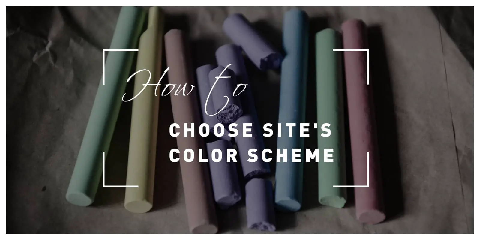
Picking the ideal color scheme
People say that you shouldn’t judge a book by its cover, but that’s not the case with a photography website. It might seem as an unessential detail, but it will make an impact far beyond aesthetics since picking the right color scheme and identifying your brand with it will play a huge role in your website’s overall design, quality, and traffic.
When you open any website, the first thing that will subconsciously draw your attention will be its color scheme. The bright colors might be dominant, which will identify it as energetic and joyful, while a darker combination has mystical, powerful, and luxurious written all over it. Your preference will serve as a representation of your personality and a factor that can make you recognizable and unique if you put enough effort into it.

Your color of choice will „set the spirit“ of your website, considering that different colors result in different emotion changes, which is why it’s such an important choice – it can create a bond between you, your brand, and your audience.
Find your pattern
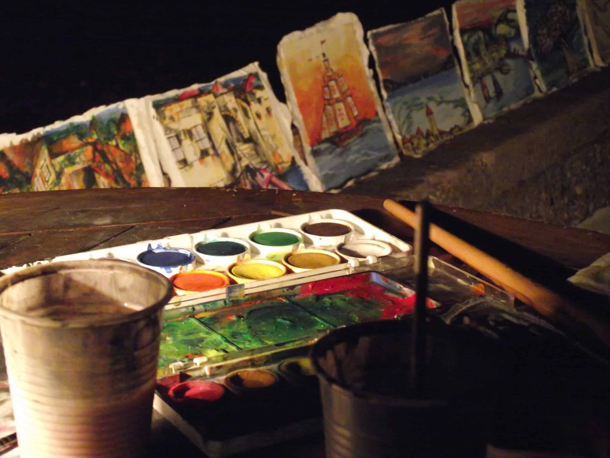
To start things off, the best method of finding the perfect one would be to browse through your photos and discover a pattern that will fit into the bigger picture. You will benefit from this method by not only identifying the best matching color but also discover patterns that are knitted in your work and help you fully understand it. That doesn’t mean they need to be identical; just follow the simple rule: if they are complementary, analogous, or monochromatic, they will work. Refreshing the background with a color that will blend with your photos is a touch of finesse, and it will put an emphasis on your content.
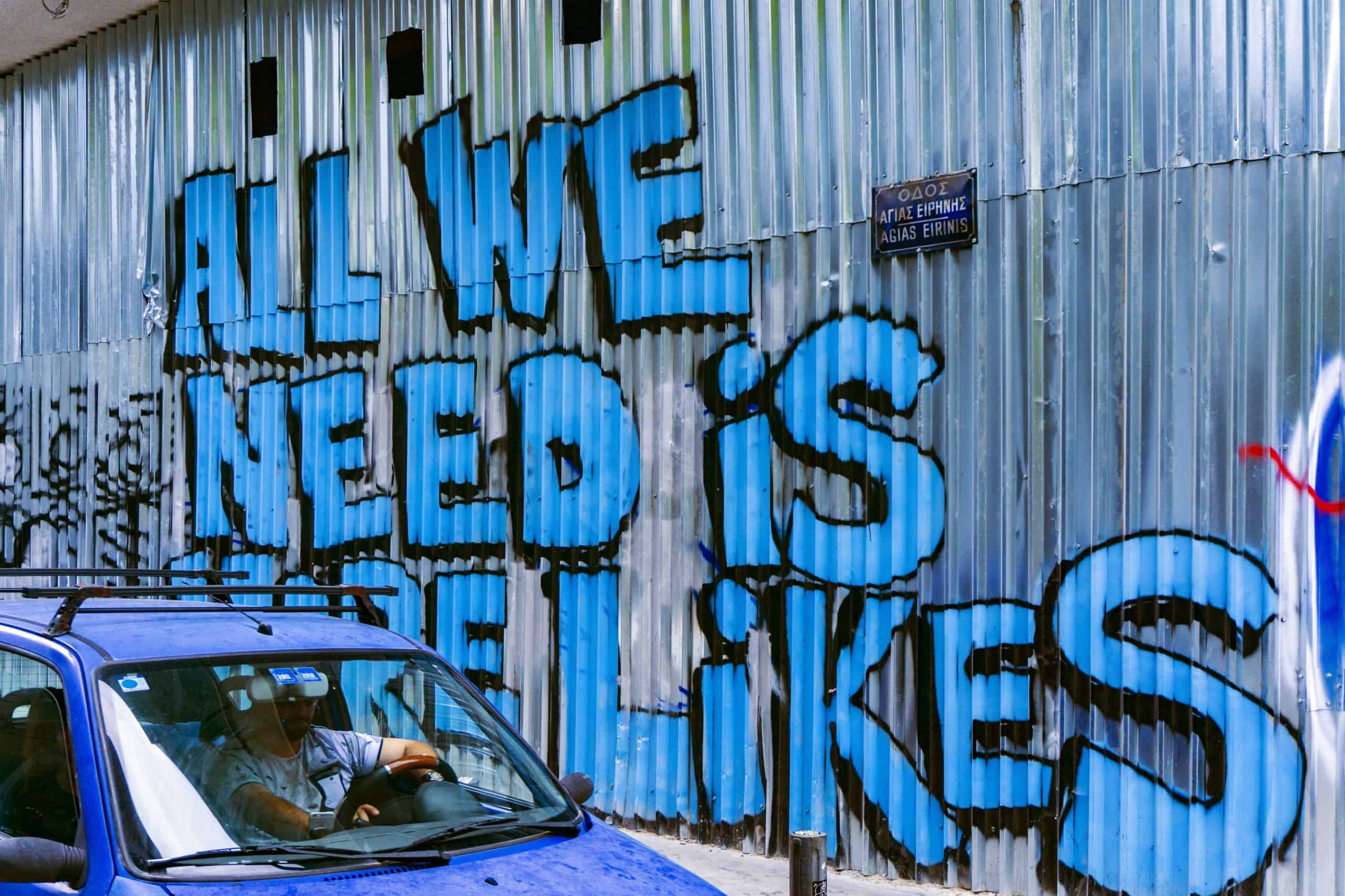
Find your emotion and connect it to your brand
Messages that you want to deliver via your work must be powerful and memorable, which is why branding is one of the key factors in your uprise. It will directly impact on how people perceive you, increase your brand awareness, and ultimately increase your value. When choosing the color scheme, you need to think about the emotions that you want to awake and link them to your brand. Should the dominant color be red that represents excitement and passion, orange with its playfulness and warmth, blue that is associated with trust and coolness, or maybe black that exudes elegance and mystery? Choose the one that has „your brand“ written all over it, but choose wisely since this is the color that will represent your alter ego.
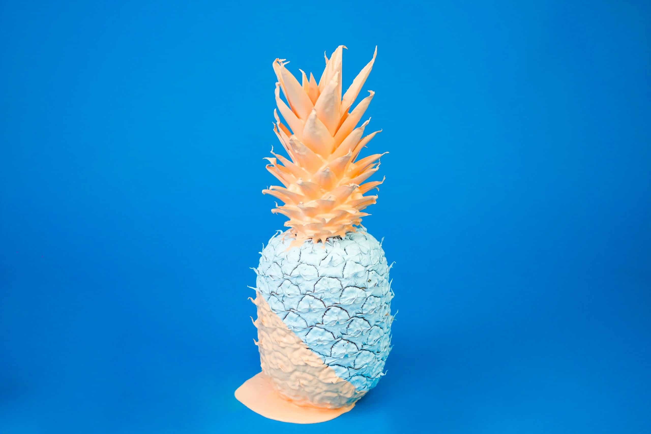
Accent on the accent
When you’ve found your dominant colors, it’s time to redirect your attention towards accent colors. Obviously, you don’t want your website to be plain and boring, which is why you need to incorporate multiple shades to get the desired final result. Therefore, you need to make a concoction of dominant and accent colors that will blossom in a magnificent, well-designed website. If you are going after a professional appearance, you can use different shades of your dominant color as an accent, or give it a pinch of complementary shades for a playful outcome. Regardless of the approach, if you blend them properly, it will result in a paradisical view for your users as soon as the website loads. But don’t get carried away in mixing; we recommend using not more than two dominant and 1 or 2 accent colors.
Keep it creative with space management
Logos, templates, links, buttons, Social Media, and the list goes on and on. There are many different sectors of your website that need to be highlighted with a different shade, which might seem like a pain in the backside, but that’s where the tables get turned. You can easily manipulate the background to your advantage by strategically emphasizing the elements that you want to point out.
It’s the perfect opportunity to let your creativity shine, and it opens up space for you to experiment with different combinations of colors that you couldn’t fit in your dominant selection. If you are feeling indecisive about your selections, we recommend coolors.co, which is a colorful place that will help you out in matching and discovering compatible shades for your website.
Conclusion
Picking the perfect color for your website can be very challenging and stressful, considering its importance and difference that it can make. The color scheme will be a reflection of your work; it will set the ambiance and eventually influence someone’s decision to click away or keep scrolling. By balancing out the shades, you can give it a rich, fresh look and turn it from dull to extraordinary. Like a puzzle, you need to assemble different shades together while keeping in mind that it’s necessary to connect it to your brand, match it with your work and ultimately choose the colors as your own signature that will make it stand out with originality and creativeness.