Some eCommerce store owners think that the quality of their products is the only thing that influences their conversion rates. While this is a contributing factor, there are many other things that affect how website visitors see your store and decide whether or not they want to purchase something from it. This includes how your website looks, ease of navigation, the 3PL fulfillment company you work with, and more.
For instance, you can’t sell anything if your store doesn’t impress people. By the way, did you know that 94% of first impressions are related to your site’s design? And once you bring people in with great web design, you need to impress them with your content strategy.
This means that you have two very important things to think about before website visitors even move on to the products you’re selling.
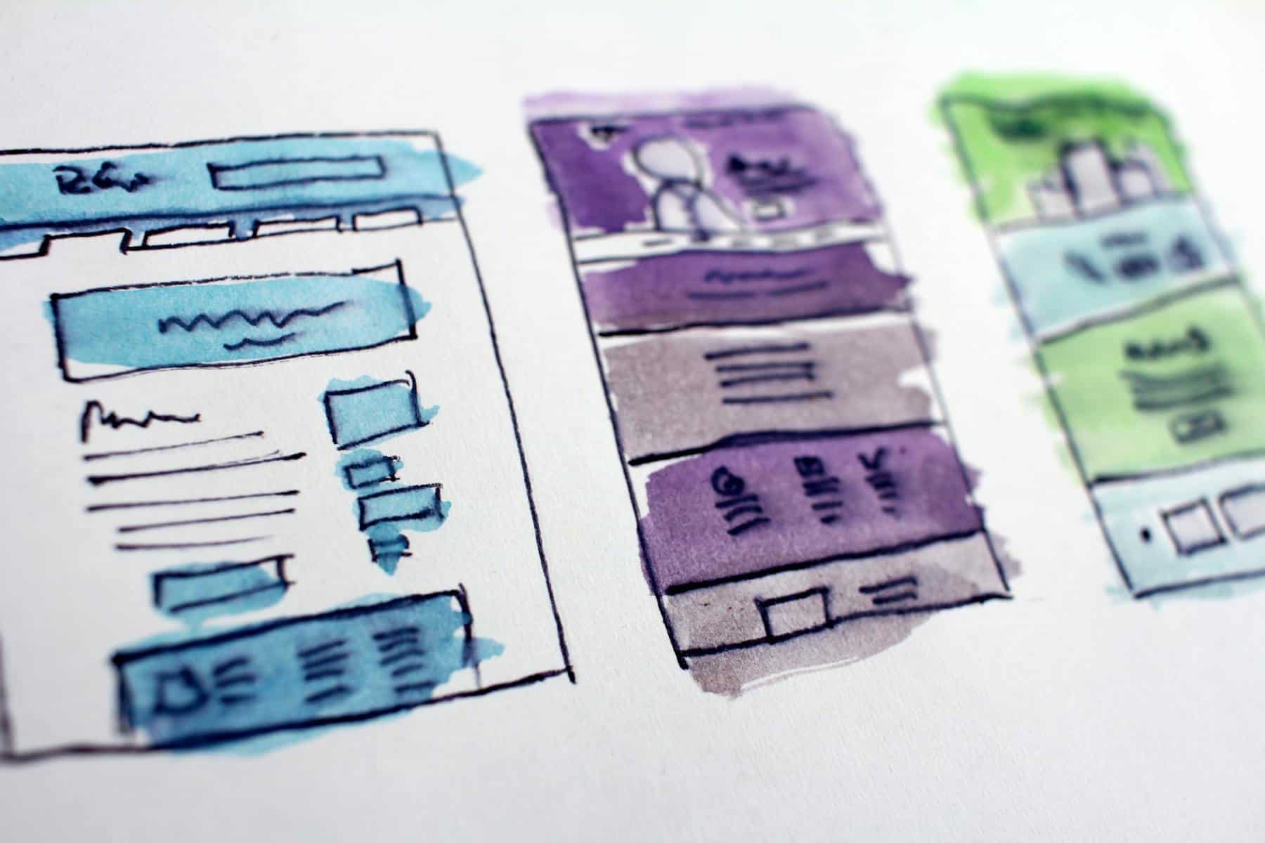
Web design

When you’re creating your eCommerce store, keep in mind that if you don’t think about conversion-focused web design in time, you probably won’t find much success. There are a lot of elements that go into great web design, and you need to make sure you incorporate all of them.
Easy navigation
Whenever people see overly-complicated website navigation, in most cases they will rather leave the website than try to find their way through the confusing elements. Remember that people who shop online do it because of the convenience, so it’s in your best interest to provide them with easy navigation.
Some tips for simple navigation include:
- Making the search bar noticeable and prominently displayed on your homepage.
- Keeping the main navigation bar that includes parent categories at the top of the page.
- Using the hover method to include specific subcategories.
- Making sure navigation is smooth on both mobile and desktop devices.
Reduce the number of choices
If your website visitors are faced with a high number of options as soon as they land on your homepage, it will take them more time to make a decision.
The best way to encourage users to make a decision is to suggest a course of action when they are faced with overwhelming choices.
For instance, instead of putting ten or twenty products on your homepage, display just one that is your most popular and highest-selling item. If the person likes what they see, they will explore your website further, just don’t overwhelm them with choices right away.
Include white space between design elements
White space, also known as negative space, is an essential design principle. This term signifies the area which is free from elements such as images and text. Don’t be fooled by the name, it doesn’t necessarily need to be white, as the background can be any color.

White space is the embodiment of the term “less is more” and it’s significant because it allows you to enhance important elements on a page and avoid meaningless clutter. By utilizing white space, you guide the website visitor’s attention to where it needs to be.
Compress your images
A slow-loading website can kill your business, and the more a page takes to load, the chances of the website visitor completely leaving the website increases. If you want to boost conversions, you need to reduce page load times as much as possible, and one way to do it is by compressing images.
Use contrasting colors to make elements stand out
There is no “one fits all” system for choosing a color scheme for your website, as it depends on what kind of products you’re selling and the type of audience you want to attract. You can read more about color theory in order to learn how to use colors the right way.

However, the one thing that is true for all websites is that the best way to make something stand out is by using contrasting colors. The most common use of this practice is making CTA buttons or pop-ups stand out much more than other elements so website visitors are drawn to them.
Content strategy
A good conversion-driven content strategy is the key to getting website visitors interested in your products. There are a few strategies that can help you have the best possible content on your website.

Write great product descriptions
When it comes to product descriptions, the more content you include, the higher your chances for high sales conversion rates are. The content you write here needs to be as descriptive as possible and include the following elements:
- A very descriptive and accurate title
- Bullet points that highlight the product’s key features
- The product name, brand, and its original description
- Technical specifications or size guide, depending on the product
- Recommendations for use and care
- All ingredients and components
- Reviews and ratings from previous customers
Aside from this, you need to include quality keywords that appear in a natural way in your product description.
Answer customer questions
Most people type in questions directly into the search bar when they want to get information, and Google provides answers in a result box at the very top of the search results. This box is called Google featured snippets and it’s very useful for bringing more traffic to your website.

The key to appearing in a featured snippet is to write conversion-oriented content that gives an informative response in great detail to questions your ideal audience is asking.
The best way to accomplish this goal is to use trending keywords, write headers in question form, and answer how-to questions in list formats.
Start a blog
Blogs are a fantastic way to promote your products, educate your customers, and improve your website’s SEO. Blogging also helps you set yourself up as an expert in your industry by providing insightful information.
Additionally, 60% of consumers say blog posts are valuable in the early stages of the buying process so if you write insightful blog posts with powerful headlines, your conversion rates will surely improve.
An important thing to remember about blog posts and any other written content on your website is to include purchase-intent keywords. Write long-tail keywords to attract people who are already interested in your products but avoid keyword stuffing, as it can only diminish your blog’s worth.
Include testimonials and reviews
When visitors are interested in your products based on their images and descriptions, they will probably still be hesitant about making a purchase. This happens because they can’t be sure the products are legitimate. With so many internet scams, people are rightfully suspicious and careful about online shopping.

Luckily, there is a way to put their mind at ease and that’s with reviews and testimonials. When a business includes reviews on their website, it makes them seem trustworthy. The average consumer reads reviews for 13 minutes and 45 seconds before making a purchasing decision.
Testimonials are a powerful tool because they allow a potential buyer to see how another person benefited from your product or how it made their life easier. Also, make sure to include a picture of the customer next to their review, as that seems more genuine than just a block of text. You should also consider adding trust badges to your site.
Final thoughts
Whether your eCommerce store is missing good web design, a great content strategy, or both, it’s hindering your chances of having high conversion rates. Luckily, now you know how to fix both of those issues so you can take your eCommerce store to the next level.

