
Color Theory & Psychology is the second article in the Ultimate Graphic and Web Design Basics Guide. It was meant for those looking to get their career started as designers, but also for those that are interested in the design process. Within the following series of the nine articles, and two “bonus tips” articles, we will cover everything you need to know to get started. Stay tuned for the following articles:
- The Basics of Graphic Design: What It Is, and What’s It For?
- Color Theory & Psychology
- Typography: How to choose the proper font
- Layout & Composition
- Photography in Graphic Design
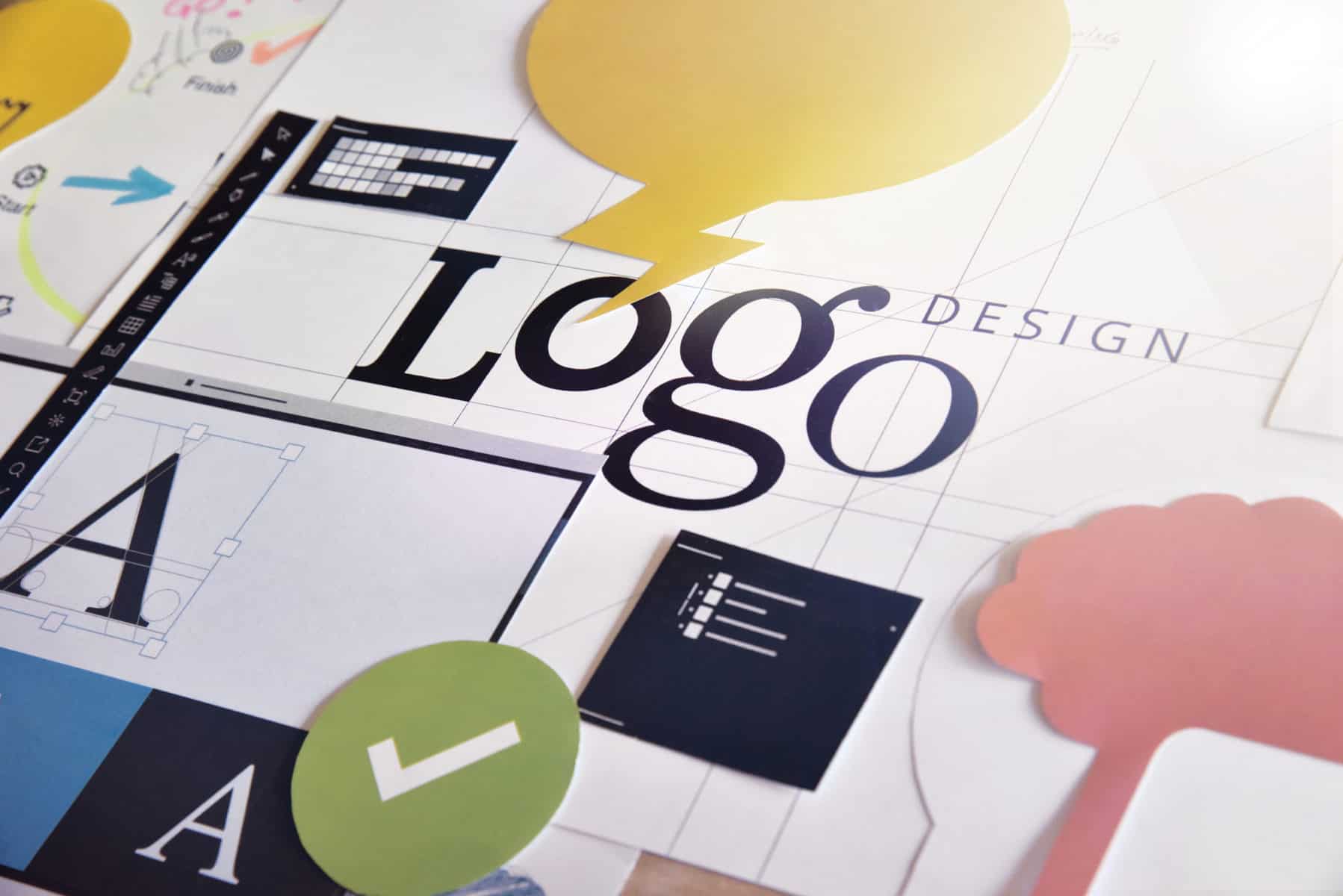
- Branding & Logo Design
- How Graphic Design Translates into Web Design?
- User Experience – How to get it right?
- Modern Trends in Design
- Bonus tip: How to find your first gig
- Bonus tip: How to work with clients
Stay tuned for the full series!
Color is something that makes the world we live in as amazing as it is. It is what gives it beauty and, in a way, emotion. To put this in more scientific terms, color is the visible portion of the light spectrum. The objects around us technically don’t have any color; it is the light reflecting from them that gives them that attribute.
Unless you are a physicist, chances are you wouldn’t use this terminology to describe color.
No matter what your description might be, it would most likely mention the fact of how impactful color can be on our lives, our thinking, actions, and reactions. But why does color have such an effect on us?
As mentioned previously, without color, our world wouldn’t be able to function in the way that it does. Just take traffic lights as an example and think about their importance in the world, and then about the huge role color plays in the way they operate. It would be hard to create a system as effective and as simple as the traffic lights one without color.
Probably the biggest effect that color has is the one on our emotions. It can make us feel irritated or all warm and fuzzy on the inside, completely alter our mood. If, for some reason, you wake up feeling (no pun intended) blue, wearing a bright color can totally turn that around by providing you with a needed boost of energy. Using color, we express our personality and make our outward appearance match what is on the inside. Besides expressing our personality, color can help you set yourself apart from others, help you make a statement by making bold and unusual color choices.
So, colors in design?

A specific color can be as effective as sounds and smells when it comes to taking us way back down memory lane. Most of us can clearly remember the color of our first bedroom or favorite childhood toy, even though we really didn’t make any effort to have that engraved in our memory. That is why color is one of the most crucial parts of memorable marketing campaigns.
The color was important to us even before the modern age. It was what kept us safe in our hunter-gatherer days by telling us what plants were edible and which creatures poisonous. No wonder color is something so impactful on us today, considering it played a role in our survival.
Although in two different cultures, two different colors can have different meanings, most colors aren’t limited by cultural boundaries. Being able to serve as a universal language is maybe the greatest asset of colors.
The importance of color is so great that it is studied in a number of fields ranging from design to psychology. Regardless of the level of knowledge you possess on color theory and psychology, you can probably give a semi-accurate explanation as to which color induces which emotion. To be sure you have a clear grasp of which color is responsible for which emotion, we are going to go through a list of the most important colors and their effects on us.
What do different colors mean?
Red
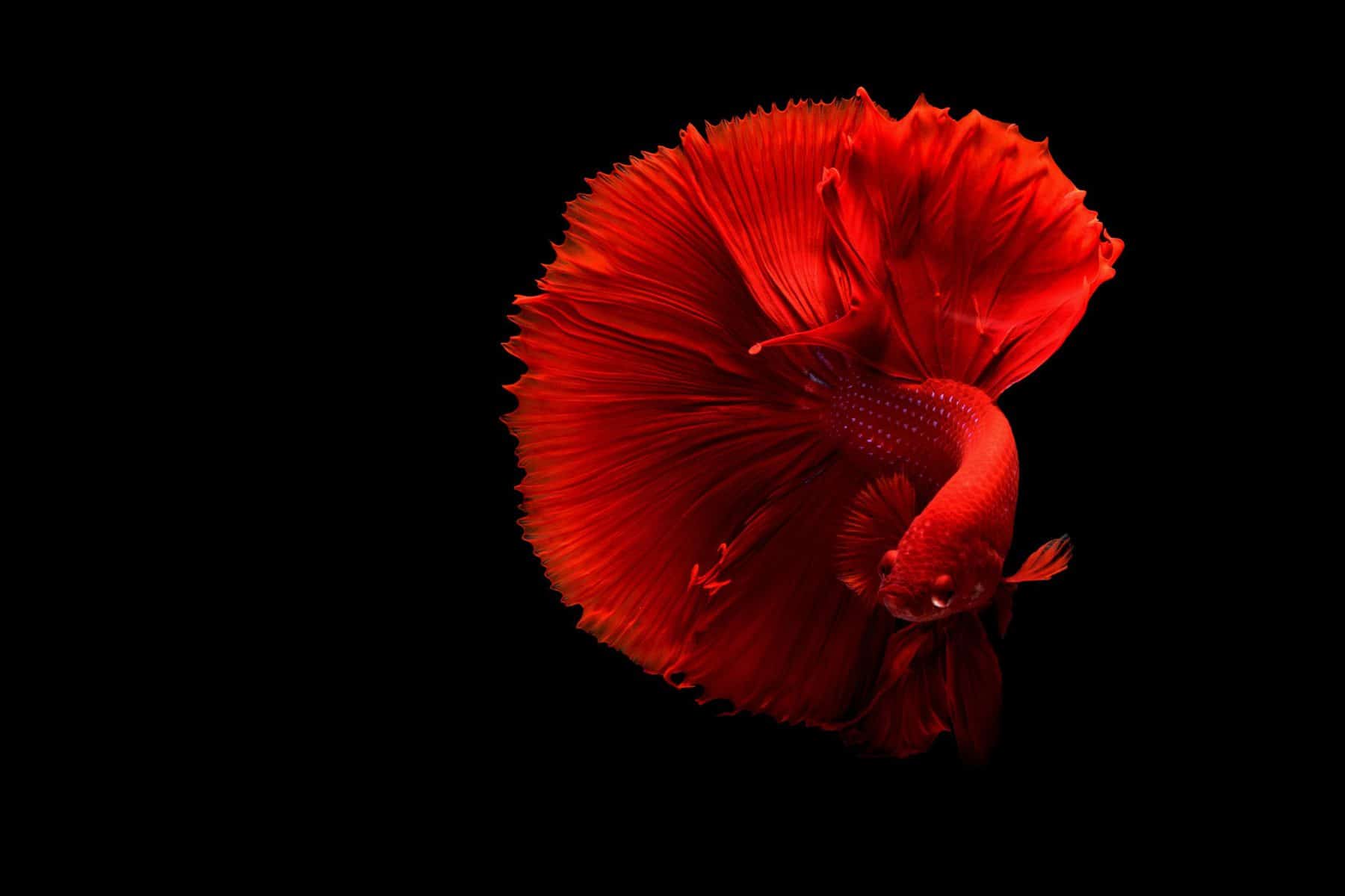
For most of us, red is the color of love and passion, and with that, of course, drama. Out of all the colors, red is probably the most eye-catching causing the most emotion and awareness and drawing the most attention making it the perfect color for alerts and warnings. It can signify danger but also power and strength. As a color, it is very effective but should be used with great caution because it can produce physical effects such as a rise in blood pressure and respiration rates.
In the western world, it is often associated with importance explaining the celebrity red carpet tradition. In non-western countries, it bears a slightly different meaning. In China, it represents happiness and prosperity, and in South Africa, it is used in times of mourning.
Orange
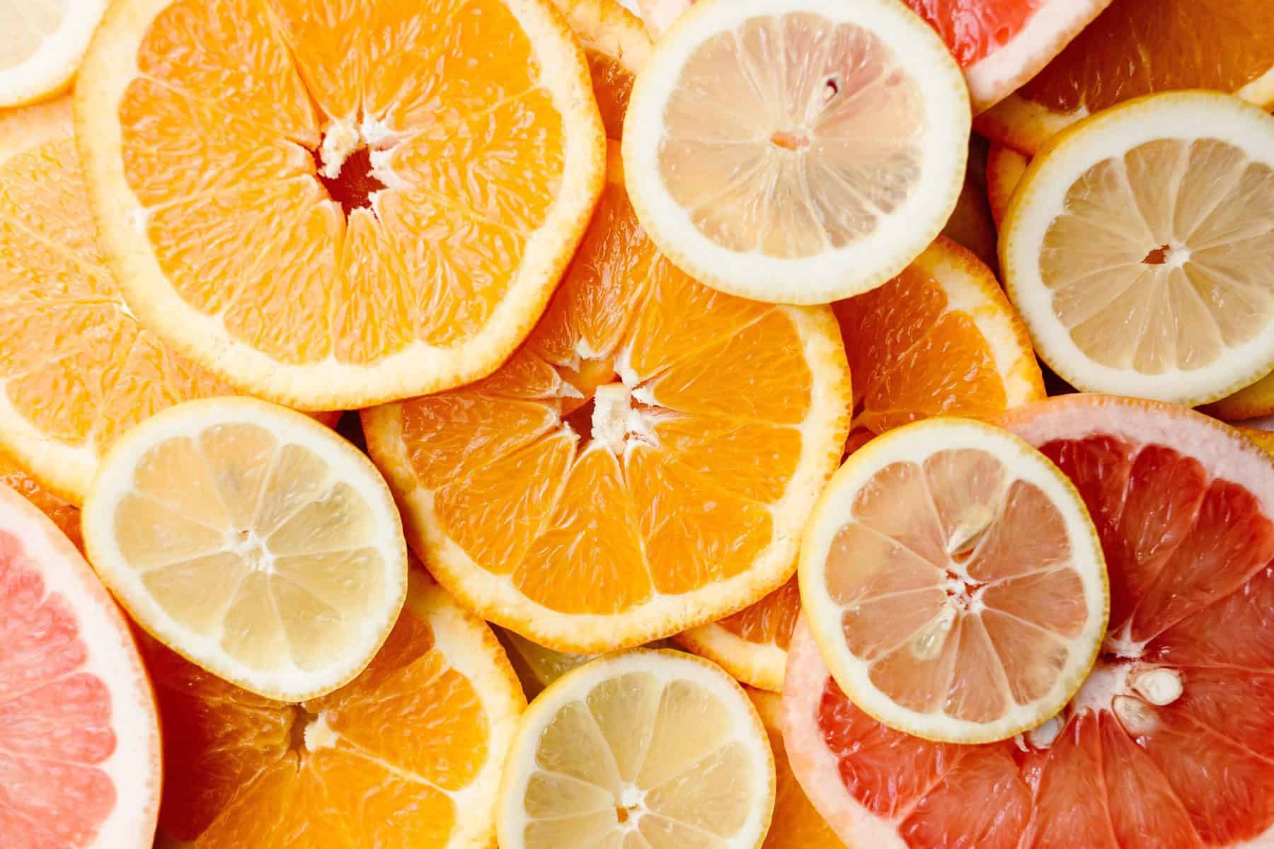
Although it is not as intense as red, orange can draw quite a bit of attention as well. Orange is the color of happiness and optimism. It’s a very inviting color which makes it loved by fun and extroverted people. It is seen as the color of freedom, representing youth and adventure. Since orange is the color of falling leaves, it can also signify change. The association with the fruit of the same name gives orange a fresh and healthy feel.
Orange is used by brands who see themselves as youthful, fresh, and are mostly geared towards the younger generation.
Yellow
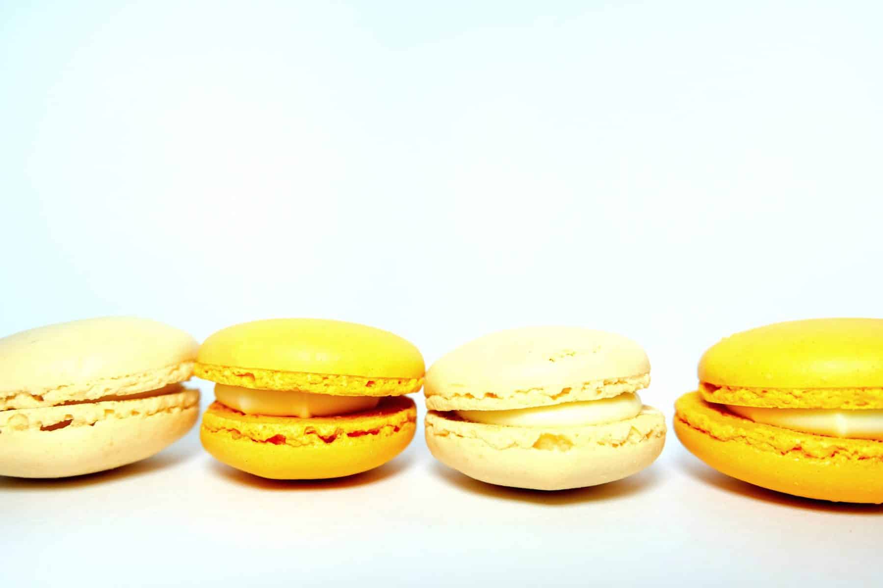
Often associated with high confidence and energy, signifying enthusiasm, happiness, and the exploration of new opportunities. Yellow is used to shift our mood in a positive direction. Like orange, it bears the name of a fresh and energizing fruit.
It’s somewhat of a tricky color to use since it can cause anxiety if overused and can look cheap in certain shades. Some of the negative connotations of yellow can be decay, illness, and danger. Also, in many languages, yellow is a term used for people seen as cowards.
All in all, yellow is a bold choice.
Blue
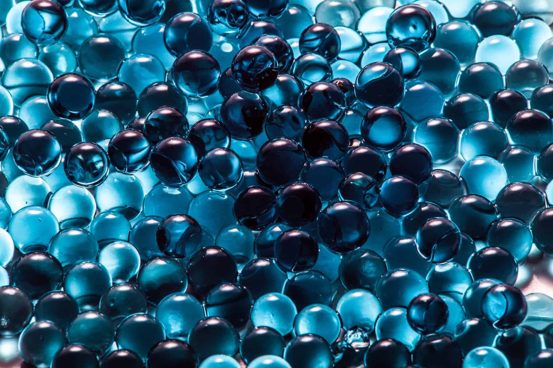
Blue is the color of peace and serenity, used when you want to give off a sense of loyalty, trust, responsibility, and honesty. It is a staple for some of the most famous brands like Facebook, Twitter, Samsung, and more.
It is used in corporate settings, airports, hospitals, and other places wanting to gain your trust.
Product-wise it is used to create a feeling of cleanliness because a lot of people associate it with air and water. It is not advised to use it with food products since it is known to suppress appetite.
Its association with sadness is also quite known, and where the term “feeling blue” comes from.
Green
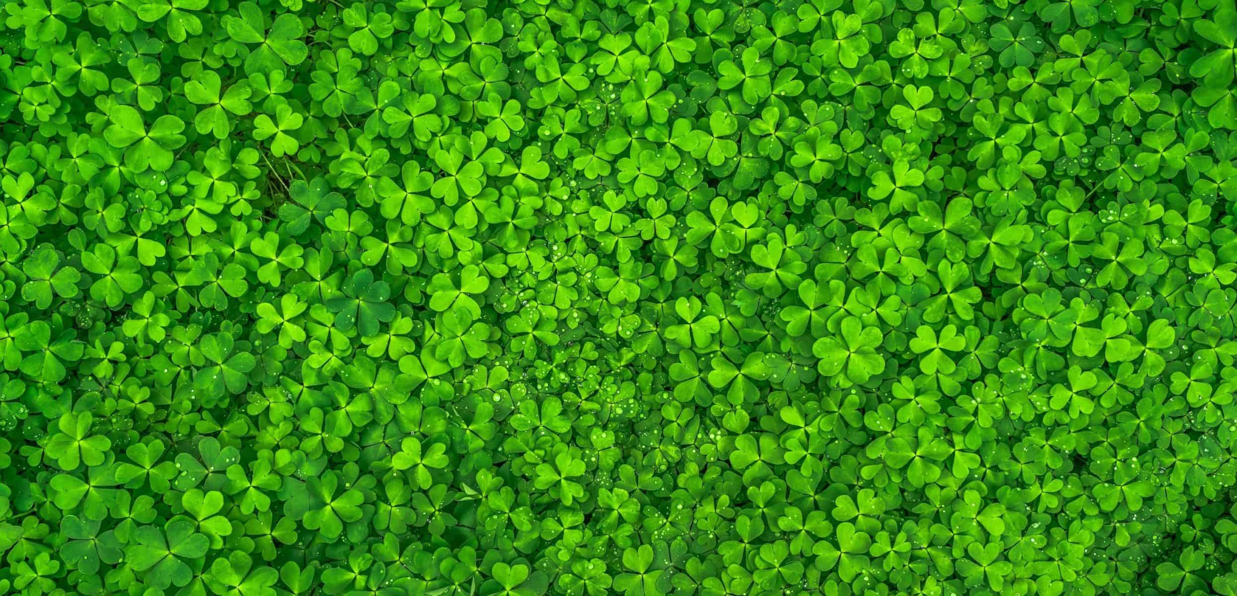
Color of nature, often bearing the meaning of new life and renewal. On the other side, the color of the American dollar has a lot of people associating green with materialism, wealth, and money. Being a mix of yellow and blue, it has both energetic and calm elements.
It is used to create a sense of harmony and stability, but in some cultures, it means a lack of experience and being a beginner at something.
Out of all the colors, green is the one that gives the most rest to our eyes.
Purple
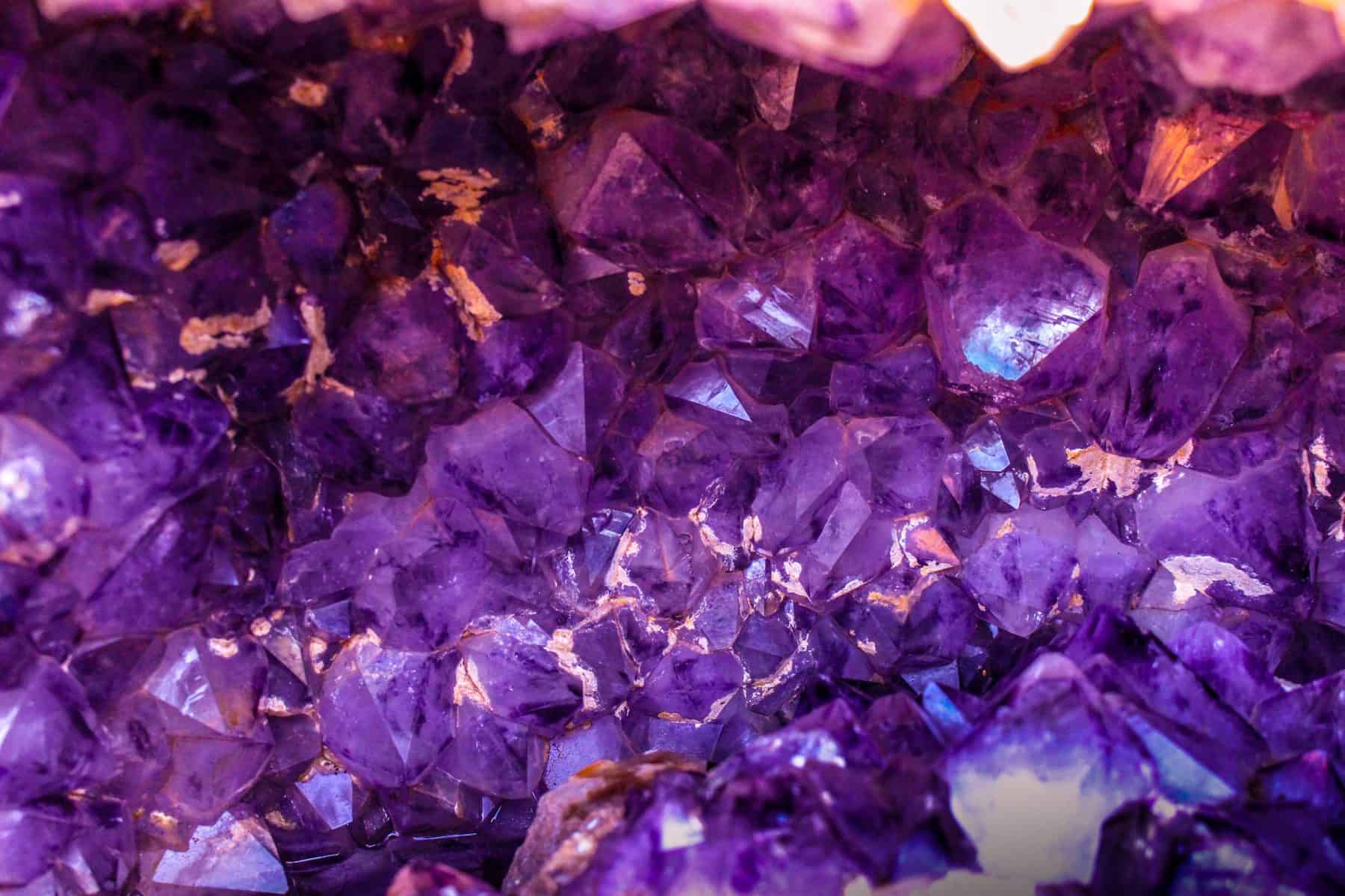
Purple can be a sign of royalty and wealth, but also spirituality and magic. It is a low-arousal color, so it is perfect for advertising relaxing products. Child products as well, since it seems to be a favorite among many children.
Since it is pretty rare in nature, purple can be seen as somewhat inorganic.
Black

Being more exact, black is the absence of color. It can be a sign of strength and power but, at the same time and pessimism and a lack of hope. It gives off a feeling of elegance, formality, and sophistication.
It is used across industries but usually in combination with other colors because it creates a good contrast.
Most think of black as a mourning color and a color of the unknown (black holes, for example).
White
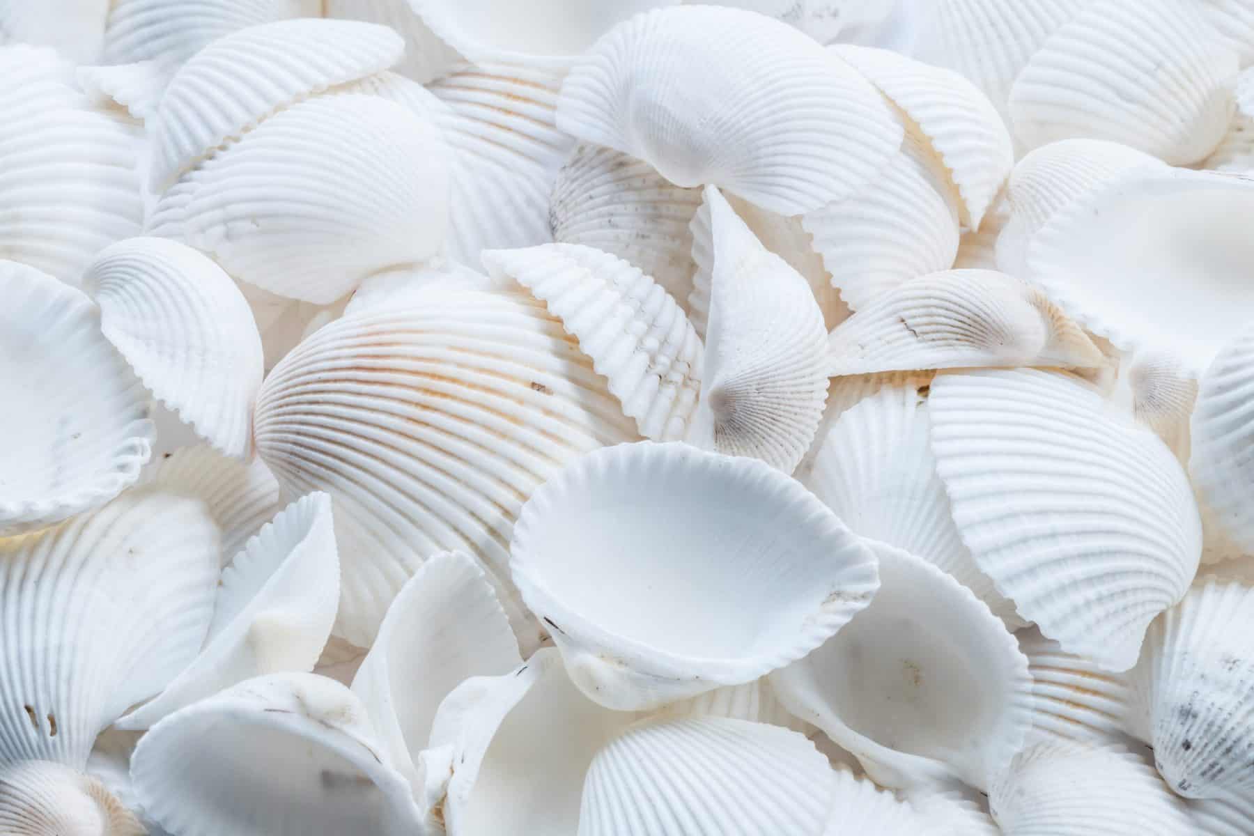
White is black’s polar opposite representing purity, cleanliness, and virtue. It is very popular in minimalist design. Its connotation with sterility and cleanliness is why it is the main color in health-related facilities, from the environment to the clothing worn by the medical staff.
Using white in your branding isn’t recommended if your brand is one with a strong and bubbly personality.
Using color to send a message
Now that you have a pretty good idea of the meanings of the most important colors, you can use that knowledge to convey your message by using them. Any message you might want to send surely has a specific color or color scheme perfect for its representation.
Before you decide on the color or color scheme, make sure you have defined the characteristics and values of your brand well, and that you know what the tone of your message should be.
Deciding on the colors isn’t an easy and fast process, and it shouldn’t be, taking into consideration the significant role it plays in your advertisement and branding. Hiring a designer is always a good idea since they are individuals who have truly mastered the art of color.
Colors as part of branding
Considering that colors create a personal experience for everyone, there will never be a color choice that will work for 100% of your audience. You should go for the colors that are the best representation of your branding, not the colors fulfilling the most stereotypes.
Have your audience always in mind, what gender is the most dominant one, in what age range does most of your audience fall into, what preferences has your audience expressed by now.
A good color choice will make your brand and its personality stand out and might even be what bring in your customers. Take McDonald’s as an example; their logo and branding had a huge role in making them the king of fast-food restaurants.
Your company’s backstory might be what could bring in customers, but a backstory is not something you can display on a storefront, a logo on the other hand is. Your logo will most likely consist of 1-4 colors, depending on the structure of your logo, with one color that will be the staple one.
When you finally find the right colors for you, make sure to stick to them and use them all around. Repetition is what will make awareness about your brand stronger. You will never see an established brand using colors other than their staple ones in their main branding.
All the marketing in the world won’t help if you have a brand that is not marketable, and a logo that is not well thought out. So don’t be stingy on the time and effort you put into making your color choices, all of it will pay off greatly down the road.