
Colors are essential and one of the most important tools, even more, if you learn how to use them. There are all types of things where color plays a key role. You might think of branding aspects like the logo and business cards right away. Nevertheless, color will also be useful across online interactions and promotional campaigns.
It’s also essential to bear in mind that your company has a personality of its own and consumers go after products that match their own personalities. Specifying your brand personality helps customers make purchasing decisions while also helping you target the appropriate audience.
Let’s begin by asking a few questions to understand a bit deeper about your brand personality. This way you can learn on how to pick the best fitting color for your brand.
- Tone: Is your brand relaxed or serious?
- Expense: Is my brand luxurious or accessible?
- Time: Is my brand modern or traditional?
- Maturity: Is my brand young or adult?
- Vivacity: Is my brand bright or neutralized?
The responses will supply you an insight of your company style, and you should use that to figure out what color fits the best for your brand.
Blue
Plenty of technology logo makers use the color blue. This color is also connected with electronics.
Specialists find that this color seems to have a soothing effect on its audiences, which is crucial to establish confidence. It manages to send a feeling of confidence and prosperity.
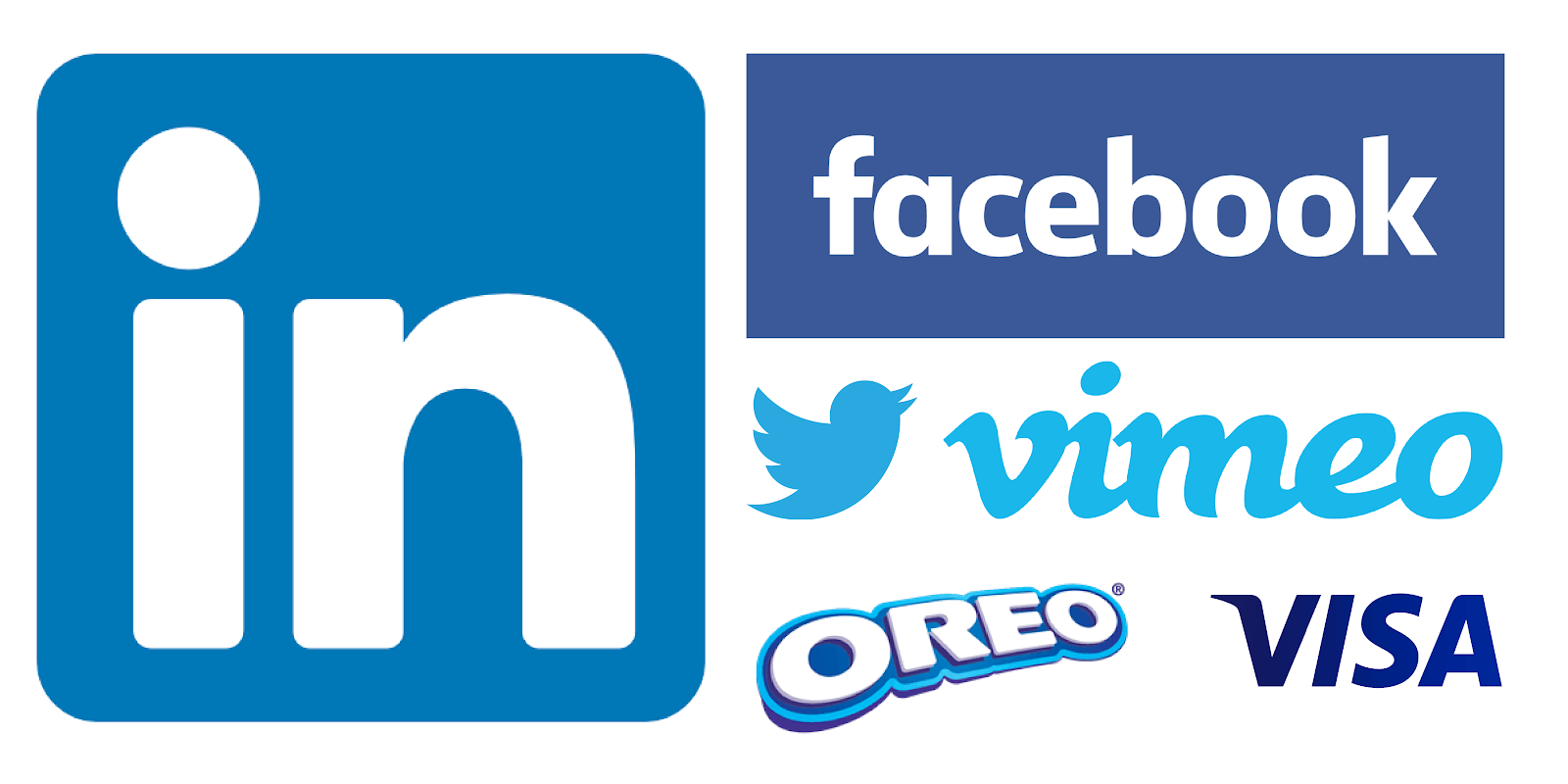
It also encourages us to be faithful, to be genuine, to be optimistic, and to be smart, that’s the main reason why it’s a great corporate color. Nevertheless, it has a lot of versatility; for example, vibrant blue will have a substantial impact on your logo while too much blue drags you down, bringing negativity. Check Logo Crisp for some awesome blue logo designs!
Black
Mysterious like the night, the lack of color is black. Despite this, it’s not absent of emotions, black actually conveys vivacity, energy, beauty, and dignity – even violence, evil, and anger.
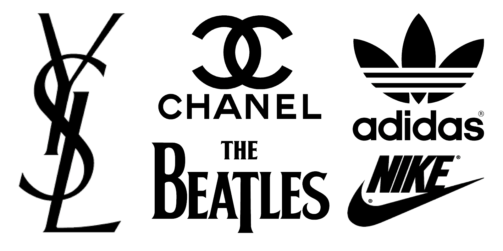
It’s a professional color and a glamorous shade. It builds trust and teases other possible emotions, as well as triggering hollow emotions. Professional Logo Designers, such as The Logo Pros, reveal that if you wish to give your logo design some mystery while still being in power, then you can rely on black, just be confident of your logo, or it could come as something negative.
Grey
More often than not the use of gray in logo designs is because this color blends along with most colors. Gray is known for the neutral tone and it evokes a bit of a cold feeling.
However, many artists use gray as an alternative to black to give the logo a somewhat different meaning.
Gray shows humility and power. That is why influential corporations use gray in their logos and other graphic products, such as business cards. Common examples of prime corporations using gray logos include the Apple logo.
White
The color theory behind white is that it advocates for authenticity. A lot of artists use white to evoke emotions of harmony, beauty, and innocence.
This really is best, though, to use white cleverly for certain colors. Make sure that the mix of white and other colors portrays the identity of your organization.
Green
Nature’s green stands for everything that is earthy and good. A broad variety of emotions can be associated with it. It is a symbol of growth, new beginnings, stability, vitality, and the environment; green is also a symbol of finance, banking, creativity, and success.
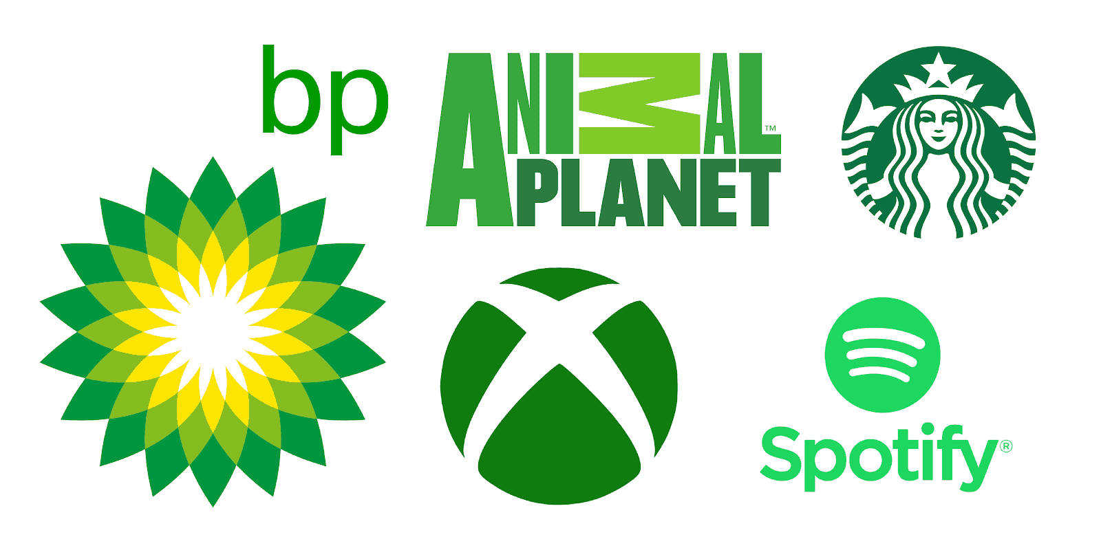
Undoubtedly, it has calming effects on us, both physically and mentally, and it is considered to have a soothing effect on human vision.
Because it takes priority in the natural world, green takes up a lot of room in the spectrum of the human eye. So, it’s the flawless backdrop for a lot of designs, because it’s noticeable everywhere.
Yellow
This color has a specific characteristic, which is the reason it is used in traffic signs, the people’s eyes see yellow preceding the rest of the colors. Even in misty weather yellow is still visible.
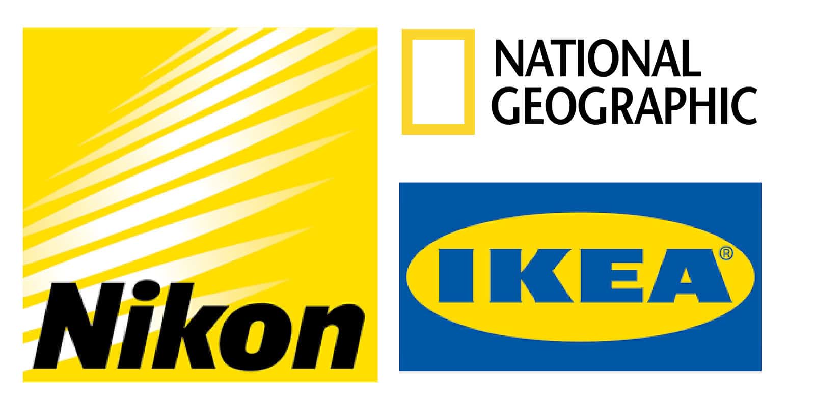
It also stands for happy emotions, sun, enjoyment, and relaxing. It conveys vivacity, promotes brain energy, and makes us smile.
Definitely consider using this color if you want to get attention, however, it is not recommended to overuse it. Too much yellow can leave people feeling nervous, and a few shades of yellow trigger negative feelings of anxiety, fear, loneliness, low self-esteem, and much more. So make sure to balance this color when in use.
Red
Intense as fire and warm as blood. Red is frequently related to passion, heat, love, desire, and determination. This is the main reason why many countries have red on their flag.
Studies say that red enhances human metabolism, raises blood tension, boosts appetite, and increases respiration rate.
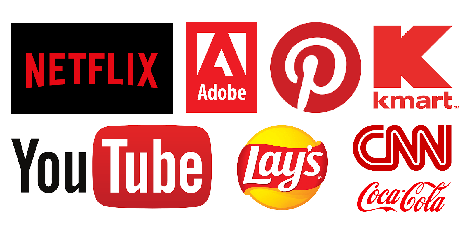
It’s vibrant and it’s certainly your go-to color if you want to get people’s attention. This is one of the main reasons why most buttons like “Buy Now” or “Press Here” are designed in this color since it’s very easy for our eyes to catch it.
Purple
The ideal mix of the fiery qualities of red and the oceanic essence of blue. It’s a rare sight in nature; that’s the main reason why it’s also seen as holy, fragile, and precious.
This color is a symbol of spirituality, love, strength, and higher self, as well as wealth, nobleness, luxury, and ambition.
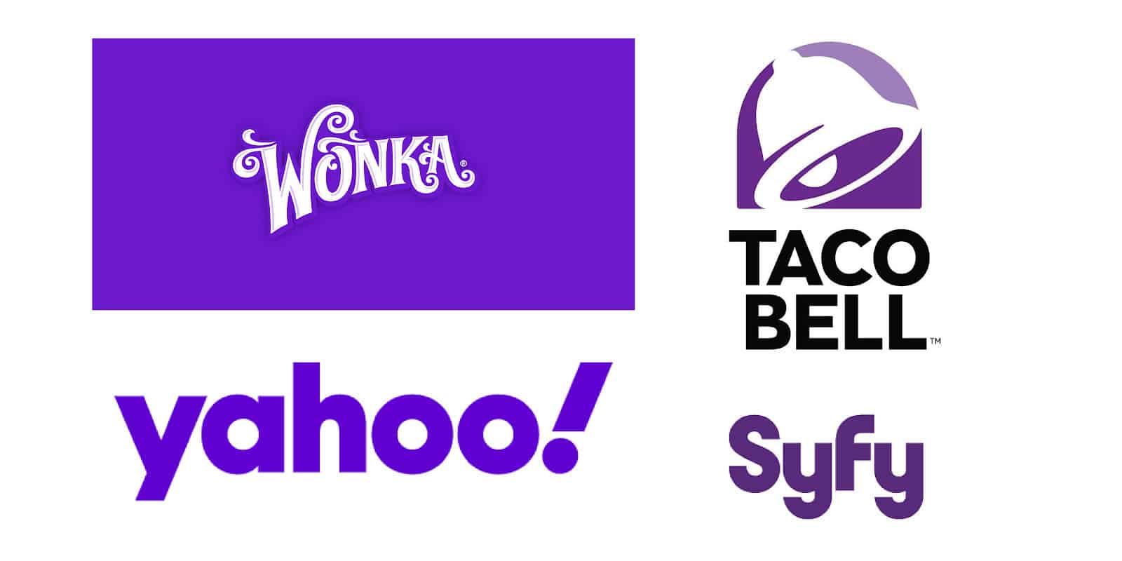
Since it is a blend of red and blue, it retains their qualities. When used in logo design, it displays beauty and glam; it has this glamorous impact that gives a sense of sophistication to those who put their eyes on it.
Conclusion
When designing a logo you need to comprehend the smallest components that are designed and think about the impact they will have on potential clients.
Researching the impacts of different influences on the human mind and behavior is recognized as psychology. Knowledge of psychological concepts helps to grasp human desires and motives, which ensures that designers can predict the responses of potential users to such solutions.
People might not realize, but the mind responds to visual stimulation that influences emotions and actions. In summary, each color and form is viewed with its own context, and when we look at a visual object, our brain receives a certain message and responds to what we see.
Design experts can monitor the significance of a logo by knowing the role of color and shape psychology. Each component designed allows people to interpret the meaning of the logo.